
How to Build Landing Pages That Actually Convert

Learn how to build landing pages that convert by matching visitor intent, clarifying offers, proving credibility, reducing friction, using real urgency, and making next steps clear.

How to Build Landing Pages That Actually Convert
Brandset TeamBrandset Team17 min de leitura

Most landing page optimization starts too late. Teams debate button colors, headline variations, page length, hero images, and whether the CTA should say "Get started" or "Start now." Those decisions can matter. But a landing page usually has more fundamental questions to answer first: did the visitor arrive expecting what this page offers? Can they understand the offer quickly? Do they have enough reason to believe it? What uncertainty is preventing them from acting? How much effort does the next step require? Does the page work well enough for the visitor to complete it?

A landing page converts when the entire experience makes the next decision sufficiently clear, credible, relevant, and easy. That's a more useful framework than looking for one design trick that universally raises conversion rates.

In short:

  • The page begins before the headline — it begins with the click that brought them: Message match between the ad, email, or post and the landing page removes one of the most avoidable forms of friction: uncertainty about whether the click led to the right place.

  • Professional design proves you're worth considering. It doesn't prove your offer works: Stanford's Web Credibility research shows visual design is one factor among several — verifiable information and third-party evidence matter just as much.

  • Urgency only works when the constraint is real: The FTC specifically flags false countdown timers and manufactured scarcity as deceptive dark patterns — and visitors increasingly recognize the fake version anyway.

  • A landing page experiment often stops at the button, but the visitor doesn't: Track what happens after the click — the form, the confirmation, the onboarding — or you're measuring an intermediate interaction instead of the outcome that actually matters.

1. Match the Page to the Reason the Visitor Arrived

A landing page doesn't begin with the headline. It begins with whatever happened immediately before the click — an ad, an email, a social post, a search result, a QR code, a referral, a button somewhere else on your website. Each one establishes an expectation.

Suppose an ad says "Free landing page audit for independent consultants" and sends visitors to a page whose headline says "Unlock Your Digital Potential." The landing page has already created work for the visitor — they now need to determine whether this is the audit, whether they're in the right place, whether it's still for consultants, and what exactly they're getting. A stronger destination continues the thought that produced the click: "Get a Free Landing Page Audit for Your Consulting Business."

This is often called message match — the destination preserves enough of the language, offer, and context of the source that the visitor immediately understands the connection. The design doesn't need to be identical. The promise should remain recognizable.

Before changing the landing page, audit the source and destination together: the ad or link that sends traffic, the promise made there, the audience it addresses, the CTA used, the offer described, the landing-page headline, the first visible supporting information, and the action available on the page. If the source says "Download the Website Conversion Checklist," the destination shouldn't force visitors to rediscover that offer among several services and products.

2. Make the Offer Easy to Understand

The visitor shouldn't need to decode your positioning before they can evaluate the offer. A useful landing page answers a small set of questions clearly: what is this, who is it for, what will I get, why might it be useful, and what happens if I act? The exact order can vary. The answers shouldn't be difficult to find.

"Transform Your Digital Future" might sound polished. It communicates almost nothing. Compare "Build and Launch a Professional Website Without Writing Code" — now the visitor can begin evaluating the product. Or "Grow Your Business With Better Financial Clarity" versus "Monthly Financial Planning for Independent Manufacturing Businesses." The second version sacrifices broad appeal for understanding. That's often a good trade.

Your headline doesn't need to explain everything. It should establish the core idea, while supporting copy clarifies the audience, differentiator, mechanism, constraints, and next step. For example: "Build a Website That Feels Like Your Brand" as the headline, followed by "Generate a business-ready site from your colors, voice, positioning, and content, then customize it visually without code." The headline creates the frame. The supporting text makes the frame useful.

One of the simplest landing-page tests requires no analytics platform. Show the page to someone reasonably close to the target audience who hasn't seen it before. After a short review, ask what the company offers, who it's for, what would happen if they clicked the main button, and what questions they'd still have before doing that. Don't explain the page while they answer. Confusion is data.

3. Design for Credibility, Then Prove the Claims

Visual quality matters because visitors use the interface itself as information. Stanford's Web Credibility Project, based on research involving thousands of participants, found that people make credibility judgments from factors including visual design, ease of use, visible organizational identity, verifiable information, expertise, contact information, and the absence of obvious errors. That's a stronger foundation than the simplified claim that "beautiful design creates a halo effect and therefore converts." Professional design helps establish that the page deserves consideration. It doesn't prove the offer works. You need both.

Credibility starts with basic execution: coherent typography, consistent spacing, clear hierarchy, appropriate imagery, readable contrast, functioning links, no obvious errors, a recognizable company or person behind the offer. A landing page that looks unfinished asks the visitor to trust the business despite evidence that the page itself wasn't finished carefully.

Evidence should support the actual claim. If you say "Save hours every week," what evidence supports that? If you say "Trusted by 10,000 businesses," is that number real and current? If you say "Increase conversions," do you have a case, experiment, or customer outcome that demonstrates it? Stanford's credibility guidelines specifically recommend making claims easier to verify and using appropriate third-party evidence, references, and information about the organization behind the site. The stronger rule for social proof is therefore: use the most credible evidence you actually have — named customer testimonials, specific customer outcomes, screenshots, product demonstrations, case studies, recognizable customers when permission exists, independent reviews, certifications where relevant, usage data you can substantiate.

Specific proof is usually more informative than praise. Compare "Amazing product. Highly recommended" with "We replaced our separate form and email setup and now manage both from the same workflow." The second tells the reader what changed. A testimonial doesn't become credible merely because quotation marks were placed around it — who said it, what was their situation, what changed, and can the claim be substantiated all matter.

4. Reduce the Effort and Uncertainty Around Conversion

A landing page can persuade someone and still lose the conversion at the form. The form is part of the offer. Every required field adds something the visitor must understand, provide, and trust you with. Baymard's large-scale checkout research has repeatedly found that perceived form effort and unnecessary fields create substantial usability friction, and that reducing fields and making validation clearer can make forms easier to complete. Baymard's research is focused heavily on ecommerce checkout rather than every type of landing-page form, so the exact abandonment figures shouldn't be generalized to every lead form — but the underlying usability principle transfers well: ask for information because you need it, not because the software allows another field.

Match form commitment to offer value. A newsletter signup might require only an email address. A personalized consultation may reasonably need name, email, company, and a small amount of qualification information. An enterprise implementation quote may need more context still. The goal isn't "use the fewest fields possible." It's "don't request more effort or personal information than the next step reasonably requires."

Explain unfamiliar requests. If you ask for company size, the visitor may understand why. If you ask for annual revenue, they may wonder what you plan to do with it. Baymard's usability research has found that missing or poorly positioned field explanations can leave users uncertain about what information is required or why it's being requested. And use validation to help people recover — don't make users complete an entire form before revealing that something went wrong, show clear errors close to the relevant field, and don't erase valid information because one field failed.

Tell people what happens next. This matters especially for service businesses. A button that says "Request consultation" still leaves questions — will someone call immediately, will I receive an email, am I booking a time, is this a sales call, will I be charged? A short explanation reduces uncertainty: "Submit the form and we'll email you within one business day to arrange a 30-minute introductory call." That's useful risk reduction because it answers a real procedural question.

5. Use Urgency Only When the Constraint Is Real

Urgency can be legitimate. A workshop starts Monday. A cohort has limited capacity. Registration closes on a specific date. Inventory is genuinely limited. Early pricing has a real expiration. Those are facts. Problems begin when the interface manufactures scarcity that doesn't exist — "Only 2 spots left!" when capacity is unlimited, or a countdown timer that restarts when the page reloads. The Federal Trade Commission specifically identifies false countdown timers and other deceptive interface techniques that create an artificial impression of limited time as examples of dark patterns that can manipulate consumer decision-making.

So the landing-page rule isn't "add urgency because people hate losing things." It's: communicate real constraints clearly when real constraints exist. Compare "Offer ends soon!" with "Registration closes Friday at 5 PM ET so we can prepare participant audits before Monday's workshop." The second gives the deadline context. Or "Only 12 seats available because each participant receives a live review" — now capacity has a reason. Transparency strengthens the information rather than asking urgency to substitute for it.

If your free trial exists every day, you don't need a timer pretending the visitor has seven minutes to start it. The page can instead make the enduring value stronger. Trust compounds too.

6. Make the Next Step Obvious and Low-Friction

The CTA should help the visitor understand the next step. Compare "Submit" with "Get the checklist." Or "Continue" with "See available times." Or "Learn more" with "See how the workflow works." Specific language reduces ambiguity — though that doesn't mean one universal CTA formula will always convert better. The copy needs to match the actual action.

A focused landing page usually benefits from a clear primary goal — "Start free trial," for example. Secondary information can still exist: documentation, FAQ, pricing details, privacy information, a demonstration. The important thing isn't enforcing "one link on the entire page." It's avoiding several equally prominent, unrelated conversion goals competing for the same visitor. A visitor shouldn't need to choose between "Start trial," "Book demo," "Download guide," "Join newsletter," and "Contact sales" unless the page intentionally serves several distinct audiences and you have evidence those paths are necessary.

"Remove all navigation from landing pages" is common advice. Sometimes it makes sense — a tightly focused paid campaign may benefit from removing broad site navigation because the visitor arrived for one clearly defined action. In other situations, navigation provides useful credibility and exploration. A visitor evaluating an expensive B2B service might reasonably want to inspect the company, pricing, security, customer stories, and documentation. Don't remove useful information simply because a CRO checklist said every outbound link is a "leak." Ask what decision the visitor is making, then decide what information supports it.

A long landing page may repeat the same action after important sections — that's not the same as creating competing CTAs. A visitor who becomes convinced halfway down the page shouldn't necessarily have to return to the hero to act. Keep the destination and purpose consistent.

Performance Is Conversion Infrastructure

A landing page cannot persuade someone while they're waiting for it to become usable. Performance should be treated as part of the conversion experience rather than merely a technical SEO concern. Google's web.dev documentation notes that conversion can be affected by site characteristics such as speed and usability as well as by external factors such as campaign mix and seasonality.

Real-world case studies also demonstrate why performance deserves attention, although individual results should never be treated as universal benchmarks. QuintoAndar, for example, reported higher conversions during a rollout that substantially improved mobile performance, alongside improvements in bounce rate and other engagement metrics. The practical lesson isn't "improving LCP will increase conversion by exactly X%." It's: measure whether slow or unstable page behavior is adding friction to your own funnel. Check Largest Contentful Paint, Interaction to Next Paint, Cumulative Layout Shift, mobile performance, and real-user data where available — and test the actual landing page on the devices and network conditions your customers use.

Risk Reduction Is Mostly About Answering Real Questions

Landing-page visitors often leave with unanswered questions — not because they're irrationally afraid of commitment, but because information is missing. For a free trial: will I need a credit card, how long does it last, what happens afterward, can I cancel? For a lead form: who will contact me, what happens to my information, how quickly will I hear back? For a service: how much does it cost, what's included, how long does it take, who is it suitable for? For software: does it integrate with what I already use, can I import my existing data, what support is available?

A strong landing page doesn't hide important information to force the click. It resolves the questions most likely to prevent it.

FAQ sections often contain questions nobody has actually asked — "Why is Company X the best choice for me?" is marketing copy disguised as a question. A useful FAQ comes from real uncertainty. Review sales calls, support conversations, chat transcripts, contact forms, objections, customer interviews, and search queries. Then answer them directly. A good FAQ can reduce the amount of sales explanation required because the page has already addressed the concern.

Credibility is also about what you don't hide. Pricing is a good example. Not every company can or should publish a simple price — enterprise contracts may legitimately depend on usage, number of locations, implementation, custom requirements, and contract length. But "Contact us for pricing" with no additional information asks the buyer to commit to a conversation before knowing whether the product is remotely appropriate. When exact pricing can't be shown, useful context may still be possible: "Plans start at...," "Typical engagements range from...," "Pricing depends primarily on...," "Designed for businesses with..." Transparency doesn't require publishing information that would be misleading. It means reducing unnecessary uncertainty.

Test the Whole Conversion Path

A landing-page experiment often stops at the button. But the visitor doesn't. They click, and then something happens — a form, checkout, a calendar, account creation, email confirmation, download, onboarding. That downstream experience can determine whether the conversion actually finishes. Baymard's extensive checkout research demonstrates how usability problems later in a process can cause users to abandon even after they've already shown significant purchase intent. The same operational lesson applies beyond ecommerce. Don't measure "CTA click" when the business outcome is "completed booking." Track the complete path.

Test Structural Questions Before Cosmetic Ones

Button-color tests are easy to launch. That doesn't make them the highest-value experiments. Before optimizing decoration, test the bigger assumptions first: does the audience actually want this offer? Does the page explain the offer clearly? Is the traffic reaching the right page? Which evidence resolves uncertainty? Are you asking for unnecessary information in the form? Does the next step make sense? Is important information appearing before the visitor needs it? Is technical friction interfering with the experience? Then move into smaller refinements. This creates a testing roadmap based on the magnitude of the underlying question.

Do Not Confuse Correlation With Causation

Suppose you change the headline, hero image, form, CTA, pricing presentation, testimonials, and page speed all at once — then conversion increases 30%. The redesign may be better. You don't know which change produced the result. That's fine if the objective was simply to replace a clearly broken page. It's less useful if the objective was learning. When you need causal insight, control the experiment carefully enough to know what changed. When you need a major redesign, accept that you may learn less about individual variables. Those are different optimization goals.

A Practical Landing Page Audit

When a landing page underperforms, review it in this order:

  1. Traffic and message match — where are visitors coming from, what were they promised, does this page continue that promise?

  2. Comprehension — can someone explain the offer after reviewing the page briefly?

  3. Audience — is it obvious who the offer is for?

  4. Value — does the page explain why the offer is useful?

  5. Evidence — which claims need proof, and is that proof credible and specific?

  6. Risk — what questions remain unanswered before someone can act?

  7. CTA — is the primary next step obvious, and does the CTA accurately describe it?

  8. Form — are you asking only for information you currently need, and are errors easy to correct?

  9. Performance — does the page load and respond well on actual devices?

  10. Post-click experience — what happens after the CTA, and does that process work?

  11. Measurement — are you measuring the final meaningful conversion or merely an intermediate interaction?

Only after those questions are reasonably addressed should you obsess over minor cosmetic optimization.

The Six Principles Together

A strong landing page does six things well. It continues the visitor's context — the page matches the reason they clicked. It creates understanding — the offer, audience, value, and next step are clear. It earns credibility — design is competent and meaningful claims are supported. It reduces unnecessary effort — forms and interactions ask only for the commitment the next step requires. It communicates constraints honestly — urgency and scarcity appear when they're real rather than manufactured. And it makes action understandable — the visitor knows what to do and what will happen afterward.

These principles are related, but they're not a rigid psychological sequence every visitor experiences identically. Different visitors arrive with different levels of knowledge, trust, motivation, and intent. A returning customer and a first-time visitor don't evaluate the same page in exactly the same way. Your job isn't to manipulate everyone through six mental stages. It's to give the right visitor enough clarity, evidence, control, and usability to make an informed decision. That's a much more durable model for conversion.

Where Brandset Fits

Landing pages rarely exist alone. Someone discovers the offer somewhere. They arrive on the page. A form may capture their information. The lead needs to exist somewhere. An email or workflow may continue the relationship. Brand context needs to remain consistent across those steps.

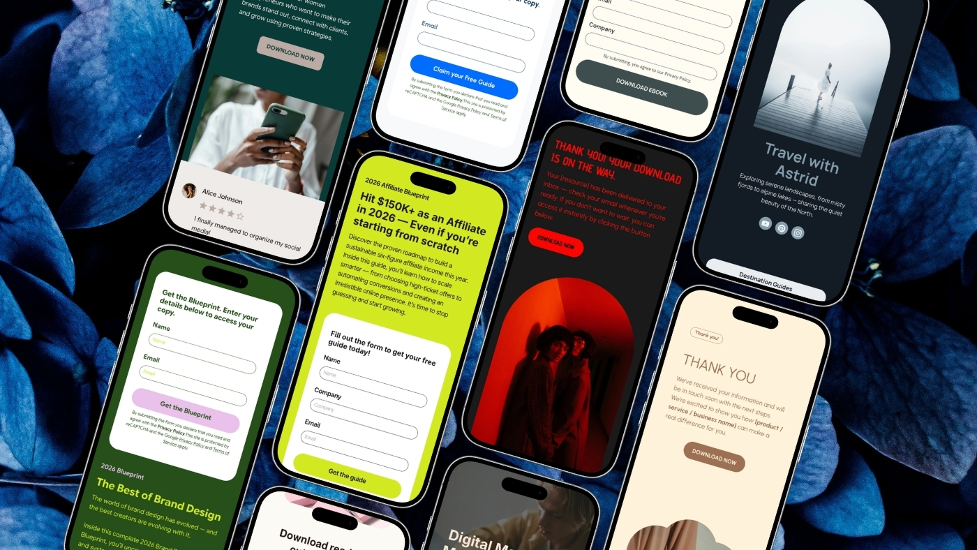
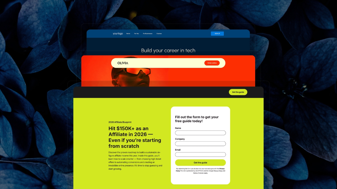
Brandset brings Landing Pages, Forms, CRM, Email Marketing, Workflows, Website Builder, and Brand Center into the same broader marketing environment. Landing Pages can be created from scratch, customized from ready-made templates, or created with AI, using the same visual block-based editing foundation as the wider Pages experience. The Brand Center keeps context such as colors, typography, voice, positioning, audience information, products, and services closer to the page-building process so every landing page doesn't need to rediscover the business from zero. Forms and lead management can then sit closer to the page and the follow-up systems around it instead of requiring the business to rebuild those connections across several unrelated products.

Brandset cannot decide whether your offer is good. It cannot manufacture credible customer evidence. It cannot decide which objections matter to your audience. Those are marketing decisions. The product's role is to make the surrounding system easier to execute once those decisions are made.

A landing page converts because the right visitor reaches the right offer, understands it, believes enough of it, encounters reasonable friction, and knows what to do next. Design supports that process. It is not a substitute for it.

Start your 7-day free trial →

FAQ - Perguntas frequentes