
What Is a Landing Page? The Complete Guide for Solopreneurs and Small Businesses

A landing page is a focused web page designed to match a specific offer or campaign, guiding visitors to a clear action and improving conversion rates for solopreneurs and small businesses.

What Is a Landing Page? The Complete Guide for Solopreneurs and Small Businesses
Brandset TeamBrandset Team20 min de leitura

You run an ad for a specific service. Someone clicks because the message matches something they need. Then they arrive on your homepage and have to start over.

Which service was the ad about? Where is the offer? Should they click Products, Solutions, Services, or Pricing? Is the promotion still available?

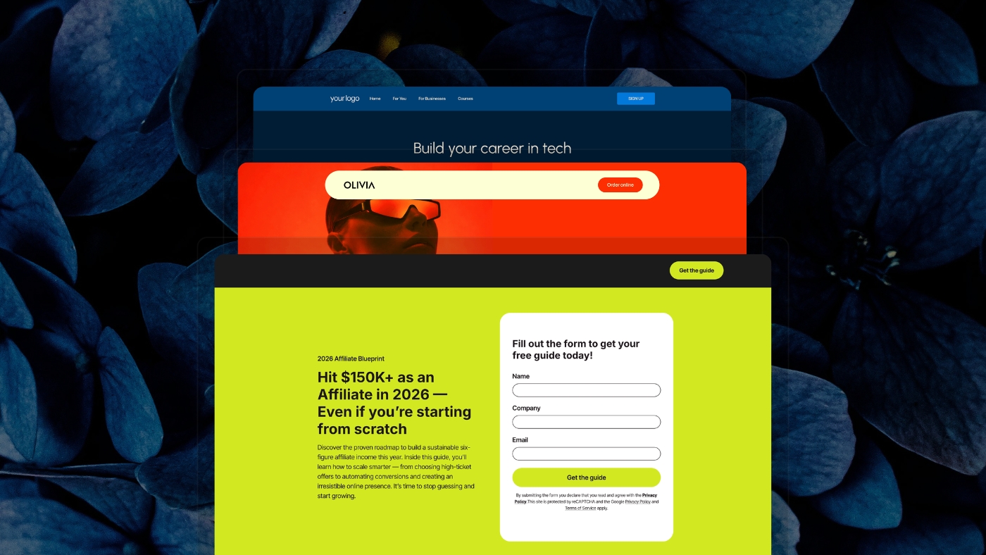
A landing page removes much of that reconstruction. A landing page is a web page created for a specific audience, campaign, offer, or action. Someone typically reaches it after clicking an ad, email, social post, search result, or other targeted link, and the page is designed to help that visitor complete a defined next step.

Forbes Advisor describes landing pages similarly: unlike a homepage, which introduces a brand and encourages broader exploration, a landing page usually focuses on a particular campaign, feature, offer, or call to action.

In short:

  • The homepage represents the business. The landing page represents one path into it: A homepage has to serve everyone. A landing page only has to serve the person who just clicked.

  • Message match matters more than any design trick: The page should continue the exact promise made in the ad, email, or post — not restart the conversation with a generic headline.

  • One primary conversion, not one rigid layout: "No navigation, one button" is a common rule of thumb, not a law. What matters is a clear primary action, not an empty page.

  • The page is one part of a longer system: A great landing page connected to a broken follow-up process still loses the lead. What happens after the form matters as much as the form itself.

That difference sounds simple. For a small business paying for traffic or trying to turn attention into leads, it can change how the entire campaign works.

A Landing Page Continues a Conversation That Already Started

Most visitors do not arrive without context. Someone who clicked an Instagram ad for bookkeeping services has already seen a message. Someone who followed an email link about a webinar already knows what the webinar is about. Someone searching Google for commercial cleaning in Chicago arrives with an intent more specific than "learn everything about this company."

The landing page should continue from that point. Google makes this connection explicit in its advertising guidance — landing-page experience is one of the components Google uses when evaluating ad quality, and Google advises advertisers to make sure the destination matches user expectations and keeps messaging consistent from the ad to the landing page.

Imagine an ad that says "Free pricing guide for freelance designers." The click should lead to a page about that guide. If the destination opens with "Helping ambitious entrepreneurs build the future" and asks the visitor to navigate through the site to find the resource, the campaign has introduced work that didn't need to exist. A good landing page preserves the context of the click.

Landing Page vs. Homepage

A homepage has a broad responsibility. It may need to serve first-time prospects, existing customers, job candidates, partners, press, and investors — people researching different products or services. It needs navigation because exploration is part of its job.

A landing page can be much narrower. Suppose a landscaping company offers residential maintenance, commercial landscaping, irrigation, seasonal cleanup, and landscape design. Its homepage may reasonably introduce all five. Now imagine the company runs Google Ads for "Commercial landscaping for office properties." Sending that visitor to the general homepage forces them to locate the relevant service again.

A dedicated page can begin with commercial landscaping, show appropriate work, address the concerns of property managers, explain the process, and lead toward a quote request. That's the practical distinction. The homepage represents the business. The landing page represents a particular path into the business.

Landing Pages Do Not Need to Be Empty Pages With One Button

One of the most persistent pieces of landing-page advice says every page should have one button, no navigation, no secondary links, and one possible action. That can work. It is not a universal law.

Google's own definition of landing-page experience considers usefulness, relevance, ease of navigation, the links available on the page, and whether the experience meets expectations created by the ad. Google does not say every useful landing page must contain exactly one link.

The better principle is to define a primary conversion — request a quote, start a free trial, register for a webinar, download a guide, book an appointment, join a waitlist, buy a product. The page should make that goal easy to understand and complete. Secondary information can still be valuable when it helps somebody make the decision.

A visitor considering a professional service may need to check credentials, understand pricing, review a case study, or read an FAQ before submitting a form. Removing that information simply to achieve an arbitrary "one link" rule can make the page worse. Focus matters more than austerity.

Why Dedicated Landing Pages Can Make Campaigns Easier to Convert

The main advantage is relevance. A homepage has to explain a company. A dedicated landing page can explain the particular thing that made someone click.

That lets you align several elements: who is arriving, what the ad or email told them, what they're being asked to consider, what would help them trust it, and what should happen next. The result is a shorter distance between initial interest and the decision the campaign is trying to generate.

Harvard Business Review has written about the value of simplifying customer journeys and reducing unnecessary complexity in customer decision-making. The broader research doesn't prove that a landing page with fewer links will always convert better, but it does reinforce the importance of reducing unnecessary cognitive work in a customer experience. The landing page is one place where a small business can apply that idea very concretely.

What Is a Good Landing Page Conversion Rate?

There is no universal number. A page asking someone to download a free checklist should not be benchmarked against a page asking someone to schedule a consultation for a $50,000 service. Traffic source, industry, price, brand familiarity, and the definition of the conversion itself all matter.

One useful reference comes from Unbounce's 2024 Conversion Benchmark Report. The company analyzed more than 41,000 landing pages, 464 million unique visitors, and 57 million conversions from July 2023 through July 2024. Across that dataset, the median landing-page conversion rate was 6.6%.

That's a platform-generated benchmark, not a universal standard. Unbounce itself warns that conversion rates vary significantly by industry and page goal — a 5% conversion rate could be poor for one type of signup and exceptional for a high-value sales page. Use benchmarks to establish context. Use your own funnel to make decisions.

Traffic Source Changes What a Conversion Rate Means

A visitor who already subscribes to your newsletter has a different relationship with your business than someone encountering an ad for the first time. The conversion data reflects that.

In Unbounce's 2024 dataset, traffic arriving from email produced an average conversion rate of 19.3%, higher than the paid channels in the same dataset. That doesn't mean email will convert at 19.3% for your business. It shows why comparing two landing pages without considering where their visitors came from can be misleading. A page receiving warm customer email traffic and a page receiving cold social traffic are solving different problems.

Before deciding a landing page is underperforming, ask where these visitors came from, what they knew before they arrived, what the previous message promised, and how large the commitment is that you're asking them to make. Conversion rate without context can send optimization work in the wrong direction.

Start With the Message That Earned the Click

The first thing on the page should make the visitor feel that continuing makes sense. For paid search, Google specifically recommends matching landing-page messaging with the user's search expectations and maintaining consistency between the ad and destination. This is often called message match.

An ad says "Payroll for restaurants with hourly teams." The page says "Payroll built for restaurants with hourly teams." The visitor immediately knows the click made sense. Compare that with "Technology that powers your potential" — it might sound more polished, but it asks the visitor to figure out what the company actually sells. The headline doesn't have to repeat the ad word for word. It should preserve the central promise.

Write the Headline for the Visitor Who Just Arrived

A landing-page headline has more context than a homepage headline. Use it. Someone arriving from an ad already knows something. Someone arriving from email may know much more. Your headline should move the conversation forward — clarifying the offer, the audience, the problem, the outcome, or the category.

"Get a custom bookkeeping quote for your consulting business" is more useful on a targeted page than "Financial clarity starts here." "Build your first client onboarding workflow in an afternoon" provides more information than "Work smarter." Clarity doesn't require boring copy. It requires enough meaning for the visitor to evaluate the offer.

Explain the Offer in Concrete Terms

The headline earns another few seconds. The rest of the page has to make the offer understandable. If you sell software, show what someone can do with it. If you sell a service, explain what's included. If you're offering a guide, tell people what they'll learn.

Vague claims create unanswered questions. "Transform your business" — how? "Unlock growth" — through what? "Take your marketing to the next level" — what will actually change? Concrete language gives the visitor something they can evaluate.

Use One Primary Call to Action

A focused landing page should have a clear primary action. That doesn't mean the CTA button can appear only once — longer pages often repeat the same action as the visitor moves through the argument. "Start your free trial" may appear in the hero, after the product explanation, and near the bottom of the page. Those buttons still support the same primary decision.

Avoid changing the action every few sections — "Get started," "Book a demo," "Download the guide," "Join the newsletter," "Contact sales," "See all products" — unless the customer journey genuinely requires those alternatives. The CTA should also explain what will happen. "Get my pricing estimate" says more than "Submit." "Reserve my seat" says more than "Continue." "Start my free trial" tells the visitor what clicking actually does.

Put Proof Where Someone Is Likely to Doubt the Claim

Trust affects online purchase decisions. Research discussed in Harvard Business Review found that trust plays an important role in consumers' willingness to buy from websites, particularly when people must make decisions without the reassurance available in a physical environment.

That makes proof important. But a row of customer logos at the bottom of the page is not automatically persuasive. Match evidence to the claim. If you say "Built for independent financial advisors," showing a financial advisor using the product is relevant. If you say "Cut reporting work from hours to minutes," a case study explaining the previous and current process gives the visitor a way to judge that statement.

Useful evidence includes testimonials with context, case studies, product screenshots, demonstrations, recognizable customers, independent reviews, credentials, certifications, and specific substantiated results. Generic praise adds much less information.

Keep Forms Proportional to the Commitment

A landing page often ends in a form. That form is part of the conversion experience. The UK Government Digital Service's form-design guidance recommends knowing exactly why every question is being asked and adding a question only when the information is genuinely needed to deliver the service. That's excellent advice for marketing forms too.

A newsletter signup may need only an email address. A consultation might reasonably ask for name, email, company, and a short description of the need. An enterprise sales process may require more qualification. The point is not to chase the fewest possible fields — know why each field exists.

Baymard's extensive ecommerce checkout testing reaches a related conclusion in a different context: the number of form fields users have to consider can create meaningful friction, and unnecessary fields should be removed or hidden when possible. Baymard's findings come from ecommerce checkout, so they shouldn't be converted into a universal formula for B2B lead forms — but the underlying principle holds. Don't ask for information simply because the CRM has an empty field for it.

Explain What Happens After the Form

A visitor should not wonder whether the button worked. If someone requests a guide, tell them where it's coming from. If they book a consultation, explain what happens next. If the team responds manually, give a realistic expectation. If they joined a waitlist, explain what joining means.

The conversion may be completed from your analytics perspective. The customer journey is continuing. A clear confirmation also prevents uncertainty from becoming unnecessary support work.

Speed Matters, but Avoid Fake Universal Rules

Landing-page advice is full of impressive numbers — "a one-second delay cuts conversion by 7%," "a one-second page converts three times better than a five-second page." Those statements are often repeated without enough context about the original study, industry, year, or methodology.

The stronger conclusion is simpler. Google's web performance guidance notes that site characteristics such as speed and usability can influence conversion, while also warning that marketing campaigns, seasonality, traffic mix, and other factors can affect conversion rates at the same time. Google recommends measuring speed improvements against business metrics rather than assuming a universal effect.

A separate Google-published study conducted with Deloitte found that improvements of 0.1 seconds across measured mobile speed metrics were associated with higher funnel progression and conversion rates for participating retail and travel brands — though the size of the effect varied by industry. For a small business, the takeaway is practical: make the page fast, measure your own results, and don't promise yourself a fixed percentage increase because you removed 500 milliseconds.

Test the Mobile Experience as a Real Experience

Mobile traffic is too significant in many industries to treat the mobile version as a compressed desktop page. Unbounce's benchmark illustrates how different the traffic mix can be by category — in its SaaS sample, 79% of landing-page visits came from mobile devices. For commercial and professional services in the same dataset, mobile generated more than four times as much traffic as desktop, while converting at a lower rate.

Those are industry-specific results from Unbounce customers. Check your own analytics before deciding what your traffic mix looks like. Then test the page on an actual phone. Can you understand the offer immediately? Does the CTA fit comfortably on screen? Is text readable without zooming? Do forms work with the keyboard open? Are buttons easy to tap? Do large images push important information too far down? Does a popup cover the entire experience? A technically responsive page can still be frustrating to use.

Remove Navigation When It Helps Focus. Keep It When It Helps the Decision.

Dedicated campaign pages often remove the full website navigation. There's reasonable logic here — a visitor who arrived to register for one webinar doesn't necessarily need links to your About page, Careers, Blog, and every other service you offer. Removing those paths can create a more focused journey.

There are also cases where navigation or secondary links are useful. Someone considering an expensive professional service may want to verify who the company is, review customer examples, check privacy information, security details, terms, pricing, or credentials.

The right question isn't "does this page have navigation?" It's "does this link help the visitor evaluate this particular offer, or does it pull them into an unrelated journey?" That produces better decisions than blindly following a landing-page template.

Build Around One Audience Before Trying to Serve Everyone

Landing pages become particularly useful when one offer is relevant to several different audiences. Imagine a software product used by freelancers, agencies, ecommerce businesses, and consultants. The product is the same. The customer context is not.

A freelancer may care about saving time. An agency may care about managing several clients. An ecommerce company may care about turning traffic into purchases. One generic page can mention all of them. Several campaign-specific landing pages can explain the same product in the context of each audience.

This doesn't mean creating hundreds of thin pages with slightly different keywords. A separate page is useful when the audience's questions, evidence, offer, or path to conversion actually changes.

Use Landing Pages for More Than Paid Ads

Paid advertising is the obvious use case because every click has a visible cost. Landing pages are useful anywhere a targeted message needs a targeted destination.

Email campaigns

A campaign about one offer can lead directly to the page that explains that offer. Unbounce's 2024 benchmark found email to be its highest-converting traffic category overall, although the exact result varies substantially by industry and audience.

Product or service launches

A dedicated page provides a clear place to explain the new offer without rebuilding the homepage.

Events and webinars

The visitor needs information about one event and a clear registration path.

Lead magnets

A guide, checklist, template, or report can have its own page explaining exactly what someone receives.

Waitlists

A landing page can introduce an idea before the full product or service is available and provide a way for interested people to express interest.

Referral campaigns

A dedicated page can preserve the offer or context associated with a specific partner or campaign.

Local and audience-specific campaigns

Different customer groups may need different evidence, language, or services even when the underlying business remains the same.

Landing Pages Can Help Test Demand, but Be Careful What You Claim

A landing page can be a useful way to test how people respond to an idea before investing heavily in it — a new service concept, an upcoming workshop, a waitlist, a proposed product, an early-access offer. You can then measure visits, signups, qualified inquiries, booked calls, or actual purchases when the offer is available.

That gives you behavioral evidence. It doesn't automatically prove product-market fit. A hundred email signups are not the same as a hundred purchases. A high conversion rate on free early access doesn't guarantee willingness to pay. Use the landing page to reduce uncertainty about demand, then validate the next assumption.

The Page Is Only One Part of the Conversion

A visitor submits the form. What happens next? This is where a landing-page campaign can expose weaknesses elsewhere in the marketing system.

Did the lead enter the CRM? Does the business know which page generated it? Does the subscriber receive what was promised? Does somebody know a quote was requested? Does the follow-up match the original offer? Can the team tell whether the lead later became a customer?

A successful form submission that disappears into an unmonitored inbox is not much of a marketing system. The landing page generated the action. The operation around it determines what happens to that opportunity.

The Hidden Cost of Building Landing Pages Across Too Many Tools

A simple landing-page campaign can easily become a stack. One tool builds the page. Another creates the graphics. A form builder captures the lead. An integration platform moves the information. A CRM stores it. An email platform delivers the follow-up. Analytics sits somewhere else. Brand guidelines live in a document.

Any one of those tools may be excellent. The operational cost appears in the handoffs — someone has to ensure the form still connects, fields map correctly, the lead reaches the CRM, the correct email gets sent, tracking works, the design stays on-brand, old offers stop running, and changes are reflected everywhere.

For a larger organization, that flexibility can be worth maintaining. For a one-person business or small team, the same architecture can create more operational work than the campaign itself. When choosing a landing-page setup, evaluate the workflow around the page as seriously as the editor used to build it.

A Simple Landing Page Structure

There's no universal layout, but this is a useful starting point for many lead-generation pages.

Open with a clear statement of what the offer is and who it's relevant to, followed immediately by the primary CTA so the visitor knows what they can do before reading further. From there, explain the key value — what they receive, solve, learn, or accomplish — and reduce uncertainty about the process with a brief explanation of how it works.

Support the important claims with evidence — testimonials, examples, demonstrations, or other relevant proof — and address the objections and questions most likely to prevent an informed decision. Close by giving someone who reached the end of the page the same clear next step they saw at the top.

Add or remove sections based on what the particular decision requires. A page asking for an email address may need very little. A page selling a high-value professional service may need considerably more. Page length should follow decision complexity.

How to Evaluate a Landing Page Before Publishing

Before sending traffic, check the page from the visitor's perspective, working through a few connected questions rather than a mechanical checklist.

Start with alignment: does the page match the source? Compare it with the ad, email, post, or search intent sending people there — Google explicitly recommends consistency between ad messaging and landing-page experience. From there, check clarity: is the offer clear enough that someone unfamiliar with the business could describe what's being offered, and is there one clear primary conversion the visitor would recognize?

Then check substance: is the evidence relevant to the specific claims people need to evaluate, and does every form field have a clear purpose? GOV.UK's form-design guidance provides a useful standard here — know why the information is needed, what you'll do with it, and which users actually need to provide it.

Finally, check the technical experience: does the page work on a real phone rather than just a desktop preview, and is it fast enough — measured against actual performance data rather than visual impressions alone? And critically, follow through past the button: complete your own form, read the confirmation, check the CRM, open the follow-up email. Make sure the campaign works beyond the click.

Where Brandset Fits

Creating a landing page is usually easy. Maintaining everything around it is where a small marketing operation becomes complicated.

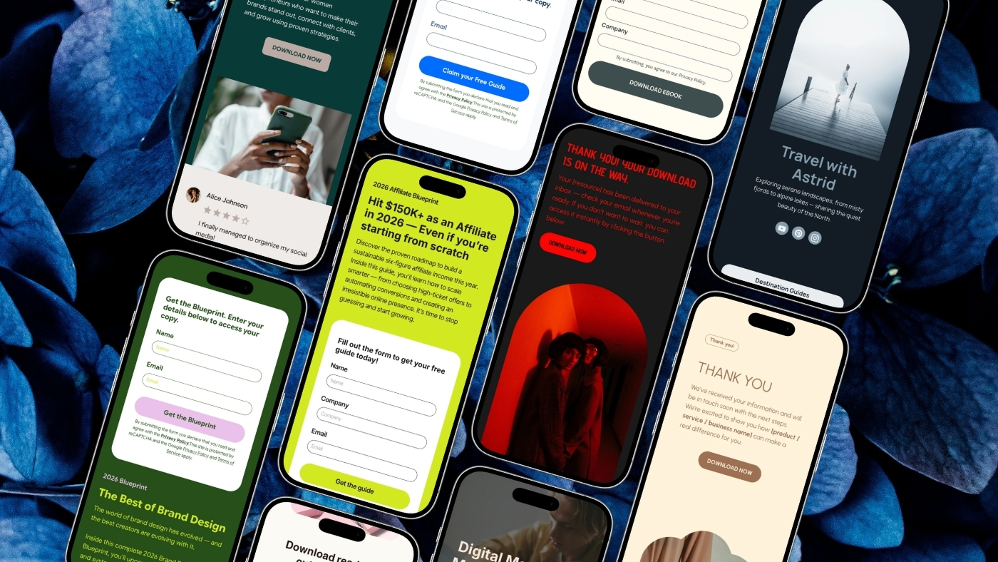
Brandset keeps Landing Pages alongside Website Builder, Forms, CRM, Email Marketing, Brand Center, content creation, and automation capabilities in the same broader marketing environment. You can create a landing page from scratch, customize a template, or use AI as a starting point, then edit the page through the same visual block-based experience used across Brandset pages.

The Brand Center also keeps information such as brand identity, colors, typography, voice, positioning, audience context, products, and services available across the work, reducing the need to rebuild the brand every time a new campaign starts.

The larger advantage is continuity. The page doesn't have to exist as an isolated artifact disconnected from the forms, leads, email, and brand context that surround the campaign. For a solopreneur or small business, that can matter more than having another specialized page builder.

Build the page around the audience that actually clicked. Continue the promise that brought them there. Give them the information necessary to make the decision. Make the action easy to complete. Then make sure the business knows what happened afterward.

Start your 7-day free trial →

FAQ - Perguntas frequentes