
Advanced Bio Link Strategy: How Creators Who Think Like Operators Build Theirs

Learn how top creators design bio link pages as conversion funnels, using tiered actions, tailored headlines, and platform-specific links to boost engagement and drive results.

Advanced Bio Link Strategy: How Creators Who Think Like Operators Build Theirs
Brandset TeamBrandset Team11 min de leitura

Most bio link pages are lists of links. A few destinations, a profile picture, maybe a short description. Functional, in the sense that someone can tap their way to your product page or your newsletter. Not particularly strategic, in the sense that nothing about the experience is designed to convert.

The creators and small business owners generating consistent revenue from their bio link aren't doing something technically complicated. They're doing something structurally different. They're thinking about the bio link page the way a product designer thinks about a funnel — as a sequence of decisions, each one designed to reduce friction and increase the probability of the next step.

This guide covers the structural principles behind high-performing bio link pages, five complete examples you can adapt, and the 20 headlines that consistently outperform generic alternatives.

Before getting into tactics, it's worth understanding what's actually happening when someone arrives on a bio link page.

They didn't arrive neutral. They arrived because something you published — a video, a post, a story — created enough interest that they tapped through to your profile and then clicked the link. That's two deliberate actions before they've seen your page. They came with a specific curiosity, even if they couldn't articulate it precisely.

The bio link page's job is to honor that curiosity by giving it a direction. Not by offering every possible destination, but by creating a clear path that matches where this visitor is most likely to be.

The mistake most bio link pages make is treating every visitor as identical — someone who arrived with no particular context and needs to see everything before they can decide what to do. In reality, the visitor who came from your TikTok about pricing strategy is in a fundamentally different state than the one who came from your Instagram Reel about your morning routine. Offering them the same page in the same order ignores the context they arrived with.

The Three-Tier Structure That Works

The most consistently high-performing bio link pages share a structural pattern that reflects how people actually make decisions: act first for those who are ready, validate for those who need confidence, explore for those who are still orienting.

Tier one: high-intent actions at the top. Buy, book, join, sign up — whatever the primary action you want warm visitors to take. The people who click your link having already decided they want to work with you or buy from you shouldn't have to scroll past five other options before finding the button. Put it first. This feels counterintuitive if you're worried about appearing too salesy, but the visitor who wasn't ready to buy yet won't be turned off by seeing a buy button — they'll keep scrolling. The visitor who was ready will convert immediately instead of getting distracted.

Tier two: trust builders. Portfolio, testimonials, case studies, client logos, press mentions. These exist for the visitor who arrived interested but not yet convinced. They're evaluating whether you're the right choice, not whether they want to make the choice at all. Social proof placed here — between the call to action and the exploratory content — catches them at exactly the moment the question is "can I trust this?" and answers it before they drift.

Tier three: low-friction exploration. Social channels, content archives, playlists, community links. This is for the visitor who's still orienting — who followed you recently, arrived from a single piece of content, and wants to understand more before committing to anything. Putting this at the bottom means they find it when they're ready for it, without it cluttering the path for visitors who already know what they want.

The order matters because it mirrors the decision sequence. Someone who arrives already intending to buy doesn't need to explore first. Someone who arrives curious doesn't need to be pushed immediately toward a purchase. The three tiers serve three different visitor states simultaneously.

The Single CTA, Multiple Paths Approach

Related to the tier structure but distinct: the single headline strategy that drives everything toward one outcome, but offers multiple entry points to that outcome at different commitment levels.

The headline states one desire — "grow with short-form content," "build a business that supports your life," "learn to invest simply." Everything on the page points toward that desire. But the specific links offer different paths to it: a free guide, a paid program, a newsletter, a YouTube archive. The desire is singular. The entry points are varied.

This works because different visitors are at different stages of trust and commitment. Someone who discovered you yesterday wants the free guide. Someone who's been following you for three months is ready for the program. A visitor who prefers learning by watching wants the video archive. All of them want the same outcome. The page serves all of them without forcing anyone into a path that doesn't fit where they are.

The failure mode is pages that offer multiple unrelated desires — here's my course on content creation, here's my fitness program, here's my podcast about travel. Multiple unrelated desires create decision paralysis and suggest that the creator hasn't figured out what they actually offer.

Platform-Specific Pages

TikTok visitors behave differently from Instagram visitors. YouTube subscribers arrive with different intent than podcast listeners. Someone who found you through search is in a different state than someone who saw you mentioned in a newsletter.

The most sophisticated bio link setups reflect this by maintaining separate pages for different sources and contexts — not one generic page that tries to serve everyone equally. A /shop page for product-focused visitors. A /work-with-me page for potential clients. A /newsletter page for content-focused visitors who want to go deeper. A /event page during active promotions.

This isn't complexity for its own sake. It's acknowledging that the same person behaves differently depending on where they came from and what they were doing when they found you — and designing for that reality rather than ignoring it.

Brandset supports multiple pages per account, which makes this approach practical without requiring technical overhead. You build the pages once, update them as context changes, and link to the appropriate one from whichever platform is relevant at any given moment.

Seasonal Relevance

Most bio link pages are built once and updated rarely. The pages that perform most consistently are the ones whose content reflects what's actively relevant right now — which changes by quarter, by campaign, and by what you're publishing.

The practical pattern: lead with whatever you're most actively talking about in your content. If you've spent the last three weeks publishing about a particular topic or offer, the bio link page should reflect that context. Visitors who came from that content arrive expecting continuation, not a static page that doesn't acknowledge what brought them there.

Updating the top section of your bio link page to match your active focus takes a few minutes and meaningfully improves conversion — because it closes the loop between what someone saw and what they find when they click.

Five Complete Examples

These aren't abstract templates. Each one illustrates the structural principles above applied to a specific creator type.

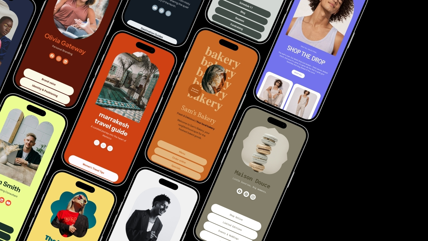
Creator and educator. Headline: "Grow your audience with timeless content — start here." Top links in order: free content playbook, creator coaching, best videos, tools recommended. What's working: "start here" reduces overwhelm for new visitors. The free playbook captures leads from people who aren't ready to pay. Coaching is visible immediately for people who are. Videos offer low-commitment exploration. The sequence respects where different visitors are.

E-commerce brand. Headline: "Minimal essentials for people who care about longevity." Top links: best sellers, new arrivals, sustainability standard, track your order, current promotion. What's working: the headline positions through worldview rather than product description — it signals who the brand is for before describing what it sells. "Track your order" reduces support volume by giving existing customers a clear path. The promotion sits last, visible to browsers but not leading with it.

Freelancer and portfolio. Headline: "Design that clarifies your value — see the proof." Top links: portfolio, book a discovery call, client results, free brand strategy guide. What's working: social proof is built into the headline itself. The portfolio and client results handle tier-two trust-building before the booking CTA would otherwise feel premature. The free guide captures leads from people who aren't ready to hire but might be in three months.

Coach and consultant. Headline: "Build a business that supports your life — not the opposite." Top links: work with me, free seven-minute training, success stories, podcast. What's working: the headline reframes the emotional problem before naming the solution. "Work with me" sits first for high-intent visitors. The training acts as a low-commitment entry point for people who need to experience the methodology before committing. Success stories handle trust.

Lifestyle creator. Headline: "Daily inspiration for people designing better days." Top links: favorite products, weekly outfit archive, wellness tools, newsletter. What's working: the headline appeals to identity and aspiration rather than product categories. Links are lifestyle-driven and naturally shop-friendly. The newsletter creates a direct channel that doesn't depend on the platform's reach decisions.

20 Headlines That Consistently Outperform Generic Alternatives

The pattern behind these: they name a desire or a direction, not a category. "Everything I teach, use, and recommend" is a category. "Learn the systems behind consistent growth — begin below" is a desire. The desire converts better because it tells the visitor what changes when they engage, not just what they'll find.

  1. "Start here — everything you need is already in motion."

  2. "Your next step toward clarity, momentum, and results."

  3. "Tools, products, and ideas — curated for your next leap."

  4. "Learn the systems behind consistent growth — begin below."

  5. "Start with what matters most — I've organized it for you."

  6. "If you want to go deeper, this is where the good stuff is."

  7. "Everything I teach, use, and recommend — all in one place."

  8. "The fastest path to what you came here to find."

  9. "The work, the products, the results — choose your direction."

  10. "Start with the essentials. Explore the rest when you're ready."

  11. "A curated hub for people building something bigger."

  12. "If you follow for value, this is where it compounds."

  13. "My best work, distilled — no scrolling required."

  14. "Start with impact. Everything else is optional."

  15. "Where ideas turn into action — pick your path."

  16. "What I offer. What I use. What can help you today."

  17. "The shortest distance between curiosity and change."

  18. "A simple place to start — a smarter place to continue."

  19. "Your gateway to deeper learning, better tools, and real results."

  20. "Everything that matters lives here — explore what calls you."

Use these as starting points and make them specific to your context. The more the headline reflects your actual offer and your actual audience, the more it converts. "A curated hub for people building something bigger" is stronger than a generic alternative — but "A curated hub for independent consultants building their first $100K practice" is stronger still.

The bio link page is the entry point. What determines whether that entry point produces compounding results is what the system behind it does with the visitor who arrives.

A visitor who signs up through your bio link newsletter form should immediately receive a welcome sequence that continues the conversation your content started. A visitor who clicks through to your product page and doesn't buy should be retargetable. A visitor who fills out a contact form should appear in your CRM with enough context that your follow-up is relevant rather than generic.

Most standalone bio link tools create the page but don't connect to what comes after. The visitor arrives, takes an action, and then enters a different system — a different email platform, a different CRM, a different automation layer — that doesn't know where they came from or what they did.

Brandset's bio link is built inside the same platform as your landing pages, email marketing, CRM, and automations. A visitor who signs up from the bio link page enters the CRM, triggers the right sequence, and receives follow-up that reflects their specific entry point — automatically, without integration overhead. The page isn't a destination. It's a door into a connected system.

Start your 7-day free trial →

FAQ - Perguntas frequentes