
Website Popup Examples That Convert Without Annoying Visitors

Learn how to create effective website popups by focusing on timing, relevance, user control, and clear offers—boost conversions without annoying visitors or harming SEO.

Website Popup Examples That Convert Without Annoying Visitors
Brandset TeamBrandset Team14 min de leitura

A popup interrupts whatever someone was doing on your website. That makes it unusually powerful and unusually easy to misuse.

Show a generic signup request before a visitor has even seen the page and the popup becomes an obstacle. Show a relevant offer after someone has had time to understand the content, or as they're leaving, and the interruption can make sense.

Google's current Search guidance is explicit about the downside of intrusive interstitials. Promotional dialogs that obscure the main content can frustrate visitors, undermine trust, and make content harder for search engines to understand. Google recommends less intrusive approaches, including banners that occupy only a reasonable portion of the screen and can be dismissed easily.

Baymard's usability testing has found similar behavior in ecommerce — test participants frequently closed newsletter overlays almost reflexively when they appeared immediately, sometimes without processing the offer at all.

That doesn't make popups inherently bad. It makes context, timing, relevance, frequency, and control part of the offer. The following examples are designed around that principle.

Get the Popup Behavior Right Before You Write the Copy

There's no reliable universal rule saying a popup should appear after exactly 10 seconds, at 50% scroll depth, or at a particular conversion benchmark. The right behavior depends on what the visitor is doing.

For Brandset popups, the practical controls are intentionally simple. You choose the specific Landing Pages and Link in Bio pages where a popup should appear, then configure each destination independently using Frequency (the maximum number of times the popup should be shown), On entering the page (whether it can appear after the visitor arrives), Delay (how long to wait before showing it), and On leaving the page (whether it should appear as the visitor is leaving).

That creates several useful patterns without requiring a complex behavioral-automation system.

Delayed entry works when the offer makes sense during the visit but doesn't deserve to interrupt the first few seconds — a newsletter signup or introductory offer often fits here.

Immediate entry should be reserved for information important enough to justify interrupting access to the page. Google specifically warns against promotional interstitials that block users from immediately reaching the content they expected, particularly from search — so immediate entry should be the exception, not the default.

On leaving captures a visitor who's already leaving, which is a different context from someone who just arrived. That can be a reasonable moment to offer a useful alternative: a guide, signup, consultation, discount, or another way to continue the relationship.

Frequency limits matter because a visitor who has already dismissed the same popup several times has communicated something — respect it. Frequency controls prevent a potentially useful prompt from turning into a recurring obstacle.

Research published by Harvard Business Review in 2026 found that giving consumers greater control over advertising experiences can improve responses compared with captive, interruption-heavy experiences. The research concerned advertising rather than website newsletter modals specifically, but the broader lesson is useful: people react differently when interruption preserves some user control.

With that foundation, the copy becomes much easier to get right.

1. The Newsletter Popup That Explains the Newsletter

The weakest newsletter popup on the internet may be "Subscribe to our newsletter." It tells people what button they're pressing. It gives them no reason to press it.

Instead, explain what will arrive:

The best small-business marketing ideas we found this week. One useful email every Friday. No daily promotions. [Get the Friday email]

Or for a retail brand:

New arrivals worth seeing, every Friday. Get first access to new drops and occasional subscriber-only offers. [Join the list]

The important part is specificity — what will I receive, how often, and why might I want it. This also creates a clearer permission relationship. The subscriber knows what they're agreeing to before submitting an email address.

Best behavior: On entering with a reasonable delay. Use it for: Newsletters, editorial updates, founder letters, weekly recommendations.

2. The Lead Magnet Popup That Names the Resource

A lead magnet becomes more convincing when it feels like an actual resource rather than something invented to collect an email address.

Weak: "Get our free guide!" Better:

The 15-Minute Website Conversion Checklist Review your homepage, navigation, forms, and calls to action before spending more on traffic. [Send me the checklist]

Or:

Download the Freelancer Pricing Workbook A simple worksheet for calculating your minimum project rate and comparing three pricing models. [Get the workbook]

The title establishes the subject. The description tells the visitor what's inside. The CTA tells them what happens next. Forbes Advisor's 2026 lead-generation guidance similarly recommends giving visitors something with genuine utility rather than creating an arbitrary ebook simply to capture contact information.

Best behavior: Delayed entry on a closely related page, or on leaving. Use it for: Guides, checklists, calculators, templates, reports, worksheets.

3. The First-Purchase Offer That Gets to the Point

Discount popups are common because the exchange is easy to understand — the visitor receives an incentive, the business gets a way to continue the relationship. That doesn't require exaggerated urgency.

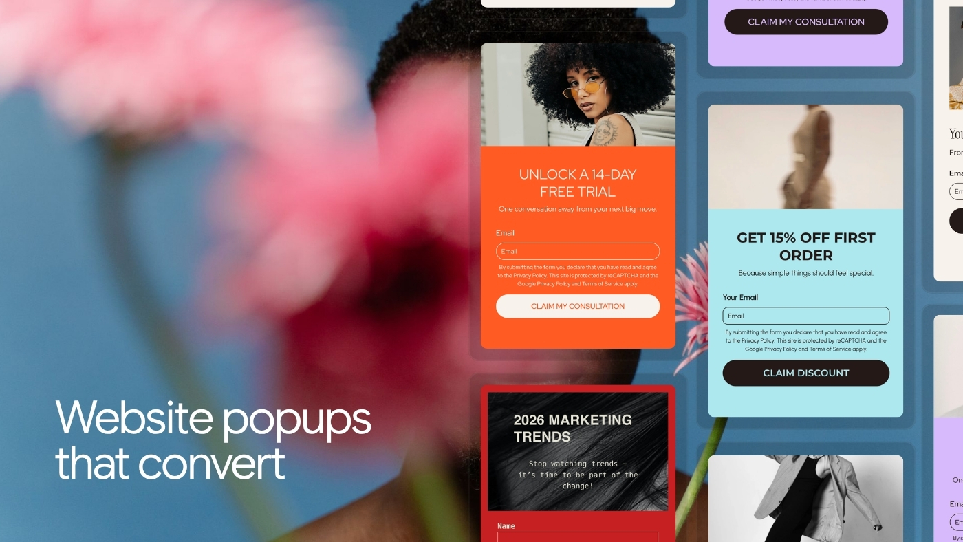
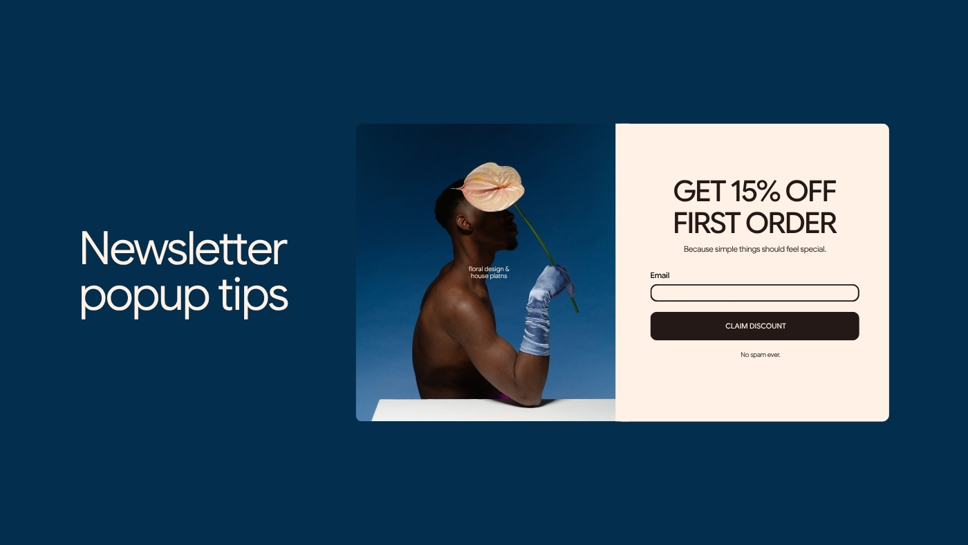
Take 15% off your first order. Join the list and we'll send your code by email. [Get my 15% code]

The useful information is immediate: the value, who qualifies, what information is required, how the offer will be delivered. You can add the broader email promise underneath — "Plus occasional new-product updates and subscriber offers." Don't hide that ongoing subscription relationship behind the discount.

Best behavior: Delayed entry or on leaving. Use it for: First purchases, introductory promotions, new-customer incentives. If the transaction takes place outside Brandset, make sure the offer and redemption process are correctly connected to whatever commerce system you use.

4. The Preference Popup That Makes Future Email More Relevant

A second field can be worth asking for when the answer actually changes what the subscriber receives.

For a jewelry brand:

Take 10% off your first order. What do you want to see more of? ○ Dainty pieces ○ Statement pieces ○ A little of both [Get my code]

For a marketing newsletter:

What are you working on right now? ○ Website ○ Email marketing ○ Getting more leads [Join the newsletter]

The question should have an operational purpose. If every answer receives exactly the same communication, don't ask. Forbes Advisor's current lead-generation guidance emphasizes simplifying the conversion process and avoiding unnecessarily heavy forms. Government digital-design standards make the same principle more explicitly: ask only for information you genuinely need.

Best behavior: Delayed entry. Use it for: Interest selection, customer type, content preferences.

5. The Event or Webinar Popup

A visitor doesn't need the entire event page repeated inside a popup. They need enough information to decide whether to investigate or register.

Free workshop: Build Your First Email Automation Thursday, September 17 · 1 PM ET See how to plan a welcome sequence from signup to first conversion. [Reserve my seat]

The popup answers what it is, when it is, what you'll get from it, and what happens when you click. If someone is already reading related content, the event feels like a continuation rather than an unrelated interruption.

Best behavior: Delayed entry on relevant campaign pages. Use it for: Webinars, workshops, live sessions, launches, local events.

6. The Consultation Popup for High-Intent Pages

Not every useful popup needs to collect an email immediately. Sometimes the appropriate next step is a conversation.

Not sure which service fits your business? Tell us what you're trying to solve and we'll help you figure out the right starting point. [Request a consultation]

Or:

Planning a website rebuild? Send us a short brief and we'll review whether we're a fit before scheduling anything. [Tell us about the project]

The second version also reduces uncertainty around what happens after submission. This type of popup works best when the page already indicates meaningful interest. A generic consultation request shown immediately to every visitor is much harder to justify.

Best behavior: Delayed entry on a closely related Landing Page, or on leaving. Use it for: Professional services, agencies, advisors, consultants, higher-consideration offers.

7. The On-Leaving Offer That Gives the Visitor Another Path

Someone can be interested without being ready for the main conversion. That makes an on-leaving popup useful when it offers a smaller next step.

Suppose the main page is asking visitors to start a trial. The leaving popup might say:

Still comparing your options? Get the Small Business Marketing Platform Checklist and see what to compare before choosing a tool. [Send me the checklist]

Notice what's missing: "WAIT!" "DON'T GO!" "YOU'RE ABOUT TO MISS OUT!" The visitor knows they're leaving. The popup doesn't need to dramatize it. A softer alternative often fits the context better.

Best behavior: On leaving. Use it for: Guides, comparisons, saved offers, lower-commitment next steps.

8. The Product or Service Update Popup

Some visitors genuinely want to know when something changes. Make that the offer.

Want to know when this service opens again? Leave your email and we'll tell you when the next intake begins. [Notify me]

For software:

We're building this now. Join the waitlist and we'll email you when early access opens. [Join the waitlist]

This can be much more compelling than trying to turn every visitor into a generic newsletter subscriber. The promise is narrow. So is the commitment.

Best behavior: Delayed entry or on leaving. Use it for: Waitlists, restocks, launches, limited enrollment, upcoming features.

9. The Content-Specific Popup

The best popup idea may already be sitting in the page underneath it.

If someone is reading "How to Improve Email Deliverability," offer:

Email Deliverability Setup Checklist SPF, DKIM, DMARC, consent, unsubscribe, and sending basics in one checklist. [Get the checklist]

If someone is reading "How to Price Freelance Projects," offer:

Freelance Pricing Worksheet Calculate your floor rate and compare hourly, project, and retainer pricing. [Get the worksheet]

This works because the popup doesn't need to guess what the visitor cares about. The page already provides context.

Best behavior: Delayed entry or on leaving. Use it for: Blog-related resources, campaign-specific downloads, creator resources, educational offers.

What Makes a Popup Feel Annoying

The format itself is only part of the experience. Several implementation decisions matter more.

Showing it before the visitor can reach the content

Google specifically advises against promotional interstitials that cover the main content immediately after someone arrives from search, recommending less intrusive banners and dialogs instead. Baymard's usability testing has also observed users closing newsletter dialogs immediately when they appeared before the visitor had a reason to engage with them. If the offer doesn't need immediate attention, delay it.

Making it difficult to close

A popup should have an obvious exit. For accessibility, the W3C's ARIA Authoring Practices recommend that modal dialogs include a visible control for closing the dialog and support closing with the Escape key, along with appropriate keyboard-focus behavior while the modal is open. A tiny low-contrast X is not a growth tactic. It's a usability problem.

Asking for too much

Name, email, phone, business name, industry, revenue, company size, job title, website URL — all for a PDF. The form should reflect the value exchange. Forbes Advisor's 2026 lead-generation guidance recommends simplifying lead forms and, in many cases, beginning with a single email field before collecting additional information later. If you need another field, know why.

Hiding the real subscription

If the visitor is entering their email for a discount and will subsequently receive marketing email, make that expectation understandable. Don't make the button say "Get 10% off" while hiding the actual ongoing relationship in fine print nobody will reasonably notice. Clear expectations produce a better subscriber relationship from the beginning.

Repeating the same ask too often

A relevant offer becomes irrelevant when it appears constantly — this is where Frequency matters. If a visitor has already dismissed the popup, you rarely need to ask again immediately on the next page. The user has already given you information. Use it.

Using a full-screen interruption for a minor offer

A newsletter doesn't usually need to hide the entire page. Google currently recommends banners that occupy a limited amount of screen space rather than page-obscuring promotional interstitials. The size of the interruption should be proportional to the importance of the message. Legal consent requirements and age verification are different cases and are addressed separately in Google's guidance.

Making the popup look like it came from another company

The popup is part of the website. Its typography, colors, language, spacing, and overall tone should belong to the same brand. This matters for more than aesthetics — a visitor is being asked to trust the business with information, and a widget that suddenly looks unrelated to the page can introduce unnecessary doubt. Consistency is particularly important after submission too. The confirmation and email that follow should feel like a continuation of the same interaction.

There Is No Universal Popup Conversion Rate

You will find popup benchmarks claiming 2%, 3%, 5%, 10%, or far more. Treat them carefully. Results vary according to traffic source, audience, incentive, page type, business model, device, form requirements, timing, existing brand awareness, and the definition of a conversion. A popup offering 20% off to existing customers and one inviting cold visitors to book a $5,000 consulting engagement should not share the same benchmark.

A better baseline is your own site. Measure your view-to-conversion rate (of the people who actually saw the popup, how many completed the intended action), dismissal rate, downstream quality (did those leads remain subscribed, purchase, book, or become useful contacts), and page performance (did introducing the popup affect the page's primary conversion).

That final question is important. A popup can increase newsletter signups while reducing purchases. That would be difficult to call a win without understanding the tradeoff. Forbes Advisor's conversion-rate optimization guidance makes the same broader point: changes should be tested against the conversion outcome rather than assumed to work because they follow a supposed best practice.

Test the Offer Before Obsessing Over the Trigger

It's tempting to spend hours debating five seconds or ten, entry or leaving, first visit or second. Those questions matter. The offer often matters more.

Compare "Subscribe to our newsletter" with "Get the freelancer pricing worksheet." No trigger can manufacture relevance that the offer doesn't have. Start by testing the larger questions: does anyone want this, does it relate to the page, is the value obvious, does the visitor understand what happens after submitting. Then refine timing and frequency.

Popups Should Support the Page, Not Compete With It

This matters especially on pages already designed around conversion. Suppose a Landing Page is asking visitors to start a free trial, and a popup appears asking them to subscribe to the newsletter. You've just introduced a second conversion path at the moment the visitor was considering the first.

Forbes Advisor's CRO guidance specifically warns against introducing competing calls to action that distract from the page's primary conversion. A popup on a high-intent page should have a reason to exist — perhaps it appears only as the visitor leaves and offers a lower-commitment resource, perhaps it addresses a specific question, or perhaps no popup is better. More lead capture is not automatically better marketing.

Where Brandset Fits

Popup campaigns often become more complicated after someone submits them. The popup collects an email. The information needs to reach the CRM. A follow-up may need to happen. The design needs to stay consistent with the page. Someone has to decide where the popup appears and how frequently people should see it.

Brandset keeps these pieces closer together. You can create popups for selected Landing Pages and Link in Bio pages and configure the behavior separately for each destination — Frequency, On entering the page, Delay, and On leaving the page, controlled per page. That makes it possible to use the same basic popup for different contexts without forcing the same behavior everywhere.

The larger Brandset environment also connects pages, Forms, CRM, Email Marketing, Brand Center, and automation capabilities, reducing the amount of context a small team has to rebuild across separate systems. The Brand Center keeps visual identity and brand context closer to the campaign as well, so the popup doesn't need to look like an unrelated widget dropped onto the page.

The goal is not to make visitors see more popups. It's to show a useful offer in a context where the interruption makes sense, give people an easy way to decline it, and make sure the relationship continues properly when they accept.

Start your 7-day free trial →

FAQ - Perguntas frequentes