 Brandset Team18 min de leitura
Brandset: An AI-Native CMS, Not Just "SEO-Friendly"
See how Brandset's AI-native CMS connects SEO, AEO, GEO, structured content, entities, freshness, and brand context without promising fake AI rankings
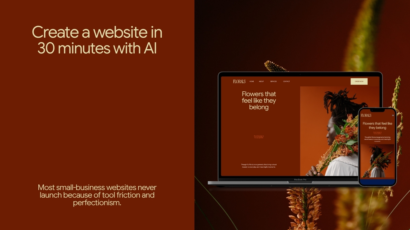
Learn how solo founders can launch a simple, effective business website in 30 minutes using AI—focus on core pages, clear CTAs, and going live fast to capture leads and drive growth.
Your website isn't supposed to sit unfinished in your drafts folder.
Its only job is to book calls, capture leads, and explain what you do to the right person — before they find someone else who already has a live page. But when you're running sales, delivery, product, and everything else solo, a "quick website update" turns into a lost afternoon, then a lost week, then a launch that keeps getting pushed.
The problem isn't motivation. It's the stack — the combination of disconnected tools, configuration decisions, and technical friction that turns a simple publishing task into an ongoing project.
Most solo operators and small business owners spend more time managing the infrastructure of their website than the content on it. They're choosing between hosting providers, connecting form tools to email platforms through Zapier, making sure the CRM actually receives new leads, and wondering why the mobile layout looks different from the editor preview. By the time the site is technically functional, the energy for the actual writing is gone.
This guide covers a different approach: a 30-minute process that gets a working, conversion-ready site live today — and the principles behind why a live first version is almost always better than a perfect draft that never ships.
There are two failure modes, and they're more common than most people admit.
The first is the endless build. The site lives in a staging environment for months while someone tweaks colors, debates the font, rewrites the about page three times, and waits for the perfect portfolio piece to add. The business keeps running without a proper web presence. Leads who could have found the site instead find a competitor who shipped something imperfect but live.
The cost of the endless build is invisible until you measure it. Every week the site stays in drafts is a week potential clients find a competitor who already has something live. An imperfect page that explains what you do and captures a lead is worth more than a perfect page that never ships.
The second is the cluttered launch. The site goes live, but it's trying to do too many things at once. Every service is explained in equal depth. There are five CTAs on the homepage competing for attention. The navigation has nine items. A visitor arrives, can't immediately understand what the business does or who it's for, and leaves. Traffic arrives and nothing converts.
Both failures come from the same misunderstanding: a website isn't a brochure that contains everything. It's a routing system that moves a specific visitor toward a specific next step.
text
Wrong model:  Site = comprehensive archive of everything we do
Right model:  Site = routing system that moves a visitor to one clear action
Once you accept the second model, the entire build process changes. You don't need twenty pages. You need four. You don't need to explain everything. You need to explain one thing clearly enough that the right person takes the next step.
This isn't a 20-page corporate site. It's the minimum viable presence that lets you safely accept money or capture an email — and that's not a compromise, it's a strategic decision.
This is not about lowering standards. It’s about recognizing that a live first version creates information, momentum, and opportunity that a draft never can. The first version does not need to be complete. It needs to be honest and usable.
To test what's actually achievable in 30 minutes, we simulated a solo consultant launching a new service-based business from scratch. Four pages: homepage, services, portfolio, contact. The structural goals were specific.
The homepage had to work as a routing interface: who is this for, what do they get, where do they go next. Not a brand story. Not a mission statement. A decision interface.
The services page had to explain the offer and the delivery mechanics clearly enough that a prospect could evaluate fit without a phone call. Transparent scope, clear outcomes, honest process.
The portfolio page had to show proof without asking the visitor to work for it. No massive PDF downloads, no password-protected case studies. Clean examples with specific outcomes.
The contact page had to capture intent without friction. One form, connected directly to the CRM, triggering an automated response before the business owner even knows the lead arrived.
The entire system went live in under 30 minutes. Copy that sounded human — not like five AI tools arguing with each other. Hosting, forms, CRM tags, and automated welcome emails all connected natively. No Zapier. No webhooks. No integrations to maintain.
This step is the one most people skip, and it's why their build takes three hours instead of thirty minutes.
Before touching any software, write five to seven lines of plain text that answer the essential questions: What does the business do, in one sentence? Who is the primary audience? What is the one action you want a visitor to take? What pages are needed to build enough trust that someone will take that action?
The brief doesn't have to be polished. It has to be specific. "I help freelance designers raise their rates and attract better clients. My audience is designers with 2–5 years of experience who feel undervalued. I want them to book a free 30-minute consultation. I need a homepage, a services page, and a contact form."
That's enough. Short, compressed, specific inputs generate cleaner output than long elaborate ones. The platform has less to interpret and fewer decisions to make on your behalf.
The rule: decide what you're building before you start building it. This sounds obvious. It eliminates 80% of the time most people waste.
Open Brandset, start a new website project, and paste your brief in plain language. Within a few minutes, the platform constructs the structural foundation: core pages, responsive layouts, navigation hierarchy, and content blocks positioned according to conversion best practices.
Treat the output as a baseline, not a finished product. The structure is right. The copy will need your voice. The images will need to be replaced. But the architecture — how the pages connect, where the CTAs sit, how the navigation flows — is already done.
The most common mistake at this stage: trying to perfect individual elements before the overall structure is confirmed. Finalize the structure, then refine the details.
Connect your Brand Center. Your logo, color palette, and typography apply automatically across every page — not just the homepage. This matters more than most people realize: visual inconsistency between pages is one of the most common reasons visitors lose trust without being able to articulate why.
Then audit the navigation from the perspective of a cold visitor who's never heard of you. The path that works for most service businesses is: Home → Services → Work → Contact. That's the psychological sequence of a prospect who needs to understand what you do, evaluate whether you're credible, and then reach out.
If a page isn't ready — if the portfolio section is sparse, if a services page needs more work — hide it from the navigation. A four-page site with tight, real content outperforms a six-page site with two placeholder pages every time.
The hero section is where most of the work happens, and it deserves most of the time.
It's not a slogan. It's not a mission statement. It's not a place for the brand's origin story. It's a routing decision: in the first five seconds, a visitor should understand exactly what this business does and whether it's for them.
One sentence states who you help and what changes for them. A supporting line removes uncertainty — either clarifying how it works or naming the specific outcome without jargon. Then one primary CTA and one secondary CTA for visitors who need more before they're ready.
The CTA is where most sites fail at this level. "Get Started" and "Learn More" are placeholders, not calls to action. Replace them with language that names what actually happens when the visitor clicks:
"Book a 30-Minute Strategy Session"
"Request a Custom Project Estimate"
"See Available Dates"
"Download the Free Guide"
The visitor should be able to read the button and know exactly what they're committing to. That specificity — naming the action rather than gesturing toward it — is one of the highest-impact conversion changes on any page.
Replace placeholder images with real ones, or remove images entirely where real ones aren't available. A page with one real image is stronger than a page with three stock photos that signal "I haven't finished this yet."
Delete any testimonials or statistics that aren't real. A single genuine testimonial with a name and a specific outcome converts better than five placeholder quotes. If you don't have testimonials yet, don't fake them — a short "what clients say about working together" section that's currently empty is better than fabricated proof.
Update the footer with real contact information and any relevant legal structure. Preview the full page on your actual phone — not just the editor's mobile preview, but your real device — to catch spacing issues and tap target problems the preview misses.
Then publish. Your site is live before lunch.
The same four-page structure adapts to different contexts without changing the underlying logic. What changes is which conversion action each page is optimized for and what proof looks like in each industry.
Business type | Homepage goal | Primary conversion action |
|---|---|---|
Coaches and consultants | Communicate the transformation, not the process | Calendar booking — "Book a Free Consult" |
Local service businesses | Establish location and scope quickly | Quote request form — "Get a Free Estimate" |
Agencies and freelancers | Demonstrate outcomes, not capabilities | Project inquiry — "Tell Us About Your Project" |
Early-stage ecommerce | Validate demand before building inventory | Single-product pre-order or waitlist |
Course creators and educators | Lead with the result the student achieves | Lead magnet or workshop registration |
The routing logic is the same across all five. State what you do and who it's for. Show enough proof that the right person recognizes themselves in it. Make the next step as frictionless as possible.
Understanding what slows people down is as useful as the process itself. These three patterns account for most of the time lost between "I'm going to launch this today" and "maybe next week."
The single most reliable way to turn a 30-minute task into a three-hour one is to start building the layout before knowing what goes in it. Decide the headline, the subheadline, and the CTA text before you open the editor. Write them in a notes app. Copy and paste. The design work takes minutes when the words already exist.
A testimonials section with two real quotes is stronger than one with six placeholder boxes you plan to fill in later. A portfolio section with three strong case examples is stronger than one with twelve placeholder cards. Launch what's real. Add the rest when it exists.
This is the most expensive decision of the three. The insights that produce a better version only appear after real visitors interact with a live page. A site that has been live for two weeks with modest traffic already contains more useful information than a site that spent two months being perfected in private. Ship the minimum that honestly represents the business, then improve it with real data.
The site being live is the beginning, not the end.
The first thing to watch is where visitors drop off. If a significant percentage of homepage visitors never reach the services page, the hero section isn't doing its routing job. If visitors reach the contact page but don't fill out the form, something in the form itself — length, field order, the CTA on the submit button — is creating friction.
These are fixable problems, but only once you can see them. A site that's been live for two weeks with modest traffic has more actionable information in it than a site that spent two months being perfected before launch.
The second thing to do is connect your email capture to a welcome sequence. A visitor who gives you their email is at peak interest in that moment. The first email they receive — within minutes of subscribing, while they're still thinking about you — is the highest-leverage communication you'll send. If that email arrives three days later because the automation wasn't set up, the moment is gone.
In Brandset, the forms on your site connect natively to your CRM and email sequences. A lead who fills out your contact form gets tagged, appears in your CRM, and enters your welcome sequence automatically. You find out they subscribed when they reply to your welcome email — not when you manually export a CSV and import it somewhere else.
That's the shift: from a site that collects information to a system that starts relationships.
The difference between a business that has a website and one that does not is not the difference between perfect and imperfect. It is the difference between being findable and remaining invisible. Ship the first version. Improve it with evidence.
Launch the first version that actually captures leads — start your 7-day free trial →
Brandset Team18 min de leituraSee how Brandset's AI-native CMS connects SEO, AEO, GEO, structured content, entities, freshness, and brand context without promising fake AI rankings
 Brandset Team12 min de leitura
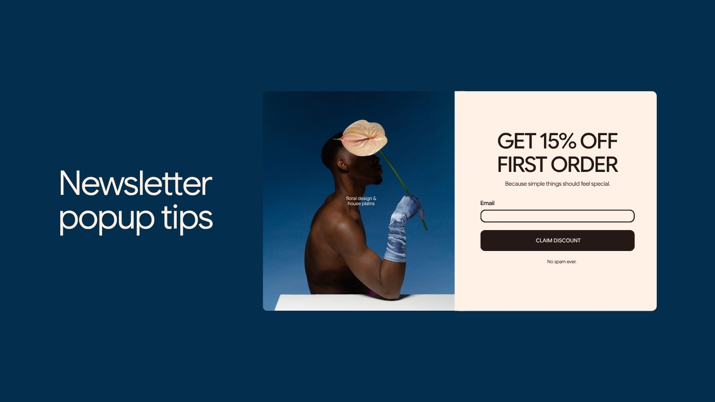
Learn how to create effective, non-intrusive newsletter pop-ups by offering clear value, matching offers to context, timing them well, and focusing on long-term subscriber engagement.