 Brandset Team18 min de leitura
Brandset: An AI-Native CMS, Not Just "SEO-Friendly"
See how Brandset's AI-native CMS connects SEO, AEO, GEO, structured content, entities, freshness, and brand context without promising fake AI rankings
Learn how to build a business website with AI: use AI for structure and drafts, but tailor content, proof, and actions to fit your real business and audience needs.
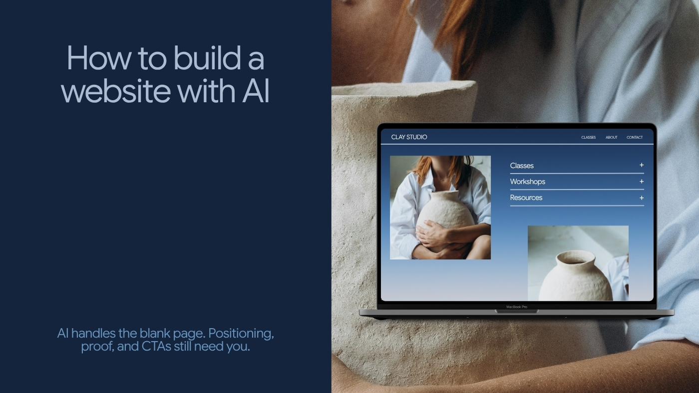
AI has made building a business website much faster. It has not made every decision automatic.
You still need to decide who the site is for, what you want visitors to understand, which action matters most, what evidence supports your claims, and what should happen after someone becomes interested. That's the difference between generating a website and building one that can actually support a business.
A useful AI website builder can remove much of the blank-page work — initial structure, layout, first-draft copy, page creation, and repetitive design decisions. The owner can spend more time on the parts that require business judgment.
This guide shows how to use that advantage without publishing a site full of generic AI copy, unnecessary pages, invented proof, or unclear calls to action.
In short:
AI solves the blank-page problem, not the business-judgment problem: It can generate structure, layout, and first-draft copy in minutes. Positioning, proof, and pricing still require a human who knows the business.
Page count should follow decisions, not templates: There's no universal rule that every business needs four pages — some launch strong on one, others genuinely need ten.
A polished draft can create false confidence: AI can make a website look finished before the business logic underneath it is finished. Treat the first output as version zero, not the launch version.
"Could a competitor say this?" is the fastest edit you'll make: If a sentence works for any business in your category, it's not saying anything about yours yet.
Before choosing a template or asking AI to generate anything, decide what the website needs to accomplish.
A consultant's website may need to produce qualified inquiries. A local service business may need quote requests. A creator may want newsletter subscribers. A new product may need a waitlist. A professional practice may need visitors to understand its services before booking an initial conversation. These are different websites even if they use similar layouts.
Start with one sentence: "The primary job of this website is to help [audience] understand [offer] and take [next step]."
For example: "The primary job of this website is to help independent financial advisors understand our monthly operations service and request an introductory consultation." Or: "The primary job of this website is to help local homeowners understand our custom cabinetry service and request an estimate."
That sentence gives the rest of the site something to organize around.
Many websites are built as archives. The business has a story, seven services, a long company history, testimonials, photos, certifications, blog posts, team bios, FAQs — so everything gets placed into navigation. The result can be technically complete and strategically unclear.
A better model:
Visitor arrives
      ↓
Understands what you do
      ↓
Recognizes whether it is relevant
      ↓
Finds enough evidence to continue
      ↓
Understands the next step
      ↓
Acts
The website can contain substantial information. It should still help people move through it deliberately.
AI performs much better when it receives useful context. You don't need a 20-page brand strategy document to begin. You do need more than "build me a website for my consulting company."
A practical brief answers seven questions.
Use plain language — "We help independent manufacturers reduce tax, import, and export complexity."
Be specific enough to influence the page — "Owners and finance leaders at small and midsize manufacturers that import components or export finished products."
"They are dealing with high tax exposure, complex customs processes, and uncertainty about available incentives."
"We combine financial advisory with practical knowledge of taxation, imports, exports, exemptions, and cost reduction for manufacturers."
"Request an initial assessment."
Experience, clients, certifications, cases, named testimonials, specific expertise, years in business. Don't invent proof because the page layout has room for it.
"Professional, direct, financially literate, and easy to understand. Avoid jargon unless it is necessary."
That's enough context to generate a useful first structure.
There's no universal rule that every small-business website needs four pages. Some businesses can launch with one strong page. Others need ten. Page count should follow the decisions customers need to make.
A simple service business might need a Home page (explain the business and route visitors toward the right next step), a Services page (what's offered, for whom, how engagement works), an About page (useful when expertise, credentials, philosophy, or personal trust affects the buying decision), and a Contact page (a clear path for qualified visitors to continue).
A business with strong proof may add Work / Case Studies. A business with several distinct offers may need separate service pages. A company investing in organic discovery may need a blog, resources, or guides.
Google's current guidance emphasizes people-first content with a clear site purpose and useful information for an intended audience rather than publishing pages primarily to manipulate search visibility. So don't create "SEO page 1, SEO page 2, SEO page 3" simply because an AI tool can generate them. Create a page when it has a job.
Now AI becomes useful. Give the builder the business context, intended audience, core offer, desired action, and necessary pages.
The first output should solve the blank-page problem — page structure, initial sections, a starting visual hierarchy, draft headings, draft supporting copy, potential CTAs, initial page relationships.
Treat this as version zero. Don't publish immediately because the page looks finished. AI can create something visually complete before the business logic is complete. That's one of the biggest traps in AI website building. A polished draft can create false confidence.
Don't spend an hour perfecting the footer while the homepage still has an unclear proposition. Start at the top.
A useful homepage should let a new visitor answer: what does this business do, is this relevant to me, why should I keep reading, and what can I do next? If the first screen doesn't answer enough of those questions, fix it before moving deeper into the site.
AI-generated websites often default to slogans — "Transforming Possibilities Into Reality," "Innovation for a Better Tomorrow," "Elevate Your Business." These phrases are grammatically fine. They communicate almost nothing.
A stronger hero gives the visitor information:
Financial Advisory for Custom Manufacturers Reduce tax exposure, understand import and export costs, identify available incentives, and make better financial decisions with advice built around manufacturing operations. Request an Assessment
That may sound less "creative." It's much easier to understand.
Use: what you help the customer achieve, followed by how / for whom / important differentiation, then a specific next action.
Book More Qualified Consultations Conversion-focused websites for independent financial advisors who have outgrown referral-only growth. Request a project estimate
The formula isn't mandatory. Clarity is.
It helps to see the whole path in one place. Go back to the manufacturing-tax brief from Step 1:
Business: We help independent manufacturers reduce tax, import, and export complexity. Customer: Owners and finance leaders at small and midsize manufacturers that import components or export finished products. Problem: High tax exposure, complex customs processes, uncertainty about available incentives. Primary action: Request an initial assessment. Voice: Professional, direct, financially literate, easy to understand.
Fed into the hero formula — what you help the customer achieve, how / for whom, specific next action — that brief produces:
Financial Advisory for Custom Manufacturers Reduce tax exposure, understand import and export costs, identify available incentives, and make better financial decisions with advice built around manufacturing operations. Request an Assessment
Notice what didn't change: the business's own words from the brief ("tax exposure," "import and export," "incentives") carried straight through into the hero. That's not a coincidence. A specific brief produces a specific hero. A vague brief — "we help businesses grow" — would have produced a vague hero no matter how the formula was applied.
This is where many AI-generated sites lose credibility. The copy sounds competent but generic — phrases like "tailored solutions," "unlock your potential," "innovative solutions," "exceptional service," "seamless experience." Nothing here is grammatically wrong. The problem is that these phrases could describe thousands of unrelated businesses.
Replace general claims with information. Instead of "We deliver tailored solutions designed to meet your unique needs," write "Every engagement begins with a review of your current tax structure, import and export costs, available incentives, and the operational decisions affecting cash flow." Now the visitor learned something.
Take a section from the website. Replace your company name with a competitor's. Does the copy still make perfect sense? If yes, it probably needs more specificity.
"Our experienced team puts customers first" — almost any business can say it. Compare: "We work specifically with custom-product manufacturers dealing with taxation, imported inputs, exports, exemptions, and production-related financial planning." Now the statement starts belonging to someone.
AI website generation creates a particular risk: it can fill empty sections with plausible-looking information. Don't let it.
Check every statistic, customer count, testimonial, certification, award, case result, year, price, location, guarantee, integration, client logo, and performance claim. If the information isn't real, remove it. Don't publish "Trusted by 10,000 businesses" because the template looked empty without a number. Don't create "'The best platform we've ever used.' — Sarah, CEO" because the design included a testimonial card.
An empty proof section is a content problem. A fake proof section is a trust problem.
New businesses often assume "we don't have testimonials, so we have no proof." Proof can take several forms: experience (what have you done before), process (can you show how the work happens), expertise (what do you know that matters to this customer), demonstration (can visitors see the product, service, or methodology), and specificity (can you describe the process well enough that the visitor can tell you understand the problem).
When available, use real customer evidence — named testimonials, cases, reviews, outcomes. Use the strongest real proof you have. Don't fill the gap with manufactured authority.
A weak service page describes capabilities — "Strategy. Consulting. Optimization. Implementation." A strong service page helps the customer decide whether the offer fits. For each service, answer: what is it, who is it for, what problem does it address, what's included, how does the process work, what outcome should the client reasonably expect, and what happens next.
You don't need to answer every possible question. You should answer enough that the customer is better informed after reading the page.
Generic buttons create uncertainty — "Get Started" with what, "Learn More" about what, "Submit" and then what happens? Prefer CTAs that describe the action: "Request an Assessment," "Book an Introductory Call," "Get a Project Estimate," "Download the Guide," "Start Your Free Trial." The CTA doesn't need to be clever. It needs to make the commitment understandable.
One primary goal doesn't mean one button. A site can repeat the same primary CTA in the hero, in the services section, and at the bottom of the page — those aren't competing goals, they're multiple opportunities to take the same next step. The problem begins when the page asks visitors to book a call, download a guide, join the newsletter, contact support, start a trial, watch a webinar, and request pricing, all with equal visual importance. Hierarchy matters.
Forms should ask for enough information to support what happens afterward. No more. A newsletter form may need only an email address. A complex B2B inquiry may reasonably need name, work email, company, and a short description of the situation. Start from the operational question — what information do we need to handle the next step well — not from "which fields can this form builder add?"
Tell visitors what happens after submission. "Submit the form and we'll respond by email to arrange an initial conversation" makes the workflow visible instead of leaving them wondering whether the button worked.
Don't treat mobile as a smaller desktop preview. Review it as its own experience. Google currently recommends responsive web design as the easiest pattern to implement and maintain, and its mobile-first indexing guidance emphasizes making the important content and metadata available to mobile users as well as desktop users.
Check headline wrapping, paragraph length, button size and spacing, forms, navigation, images, tables, popups, sticky elements, the footer, tap targets, and horizontal overflow. Also test on a real phone. An editor preview is useful. An actual device shows you what the experience feels like.
AI-generated sites sometimes create the opposite SEO problem people expect. They can generate lots of text. That doesn't mean the text is useful.
Google's guidance explicitly recommends content made primarily to benefit people and warns against using extensive automation primarily to generate search traffic. It also encourages clear page titles, original value, trustworthy information, and content that leaves the intended audience feeling they learned enough to achieve their goal.
Before publishing, review each important page against a short list: does it have a clear purpose, does the title accurately describe it, is the main topic obvious, does it answer questions customers genuinely have, does it contain original business information, are the claims supportable? SEO still matters. The path to better SEO is not publishing more generic pages faster.
Building the visible page is only one part of launching a site. Before publishing, review the operational settings. In Brandset, the guided website setup can cover basic site information, site name, domain, favicon, Google Business Profile options, WhatsApp button, contact-notification emails, search-engine visibility, page-level search settings, social sharing presentation, AI visibility settings, FAQ information, and privacy-policy setup.
The exact choices depend on the business. A local service company may care heavily about Google Business Profile and WhatsApp. A B2B SaaS company may not. A professional practice may need different privacy and contact considerations. The setup should reflect the real business rather than activating every available option.
Create a short launch QA process covering a few areas.
Content — are names correct, are services current, are prices correct where shown, are all claims true, are placeholder sections gone?
Links — do buttons go to the right destination, do navigation and external links work?
Forms — can you submit them, does the expected next step occur, does the business receive the information it needs?
Images — are they relevant, do they load, are they appropriately sized, do informative images have useful alt text?
Mobile — have you tested real mobile pages?
Search — are titles and descriptions appropriate, is important content indexable where intended?
Contact information — is the email, phone, address, or other contact method correct?
Legal and privacy — are the required business policies and notices present for your situation?
Don't assume generated content means completed setup.
A business website is rarely finished. Services change. Positioning improves. New proof appears. FAQs emerge. Customers reveal what they don't understand. Search demand changes.
Waiting for every future page to exist before publishing creates a strange standard — the site can't launch until it already contains everything it might eventually need. A stronger standard: is this version accurate, credible, usable, and sufficient for the visitor to take the intended next step? If yes, publish. Then improve from evidence.
"Minimum viable" shouldn't mean incomplete. It means the smallest site that honestly performs the required business job.
For a service business, that might be a clear proposition (what do you do), an intended customer (who is this for), an offer (what can someone hire or buy), evidence (why should the visitor take the business seriously), a next step (what should an interested person do), a contact mechanism (can they actually do it), and basic trust and operational information (can they understand who's behind the site). That may fit on one page, or require several. The architecture follows the buying decision.
An independent operations consultant's home page might read "Operations Systems for Small Advisory Firms — simplify client onboarding, recurring reviews, internal tasks, and follow-up without adding unnecessary software or headcount," with the CTA "Request an Operations Review." Three clearly defined offers, not fifteen capabilities. Relevant experience and operating philosophy on the About page. Useful analysis showing how the consultant thinks. A focused inquiry form. That's enough to create a credible starting point.
A custom cabinet manufacturer might prioritize a home page covering what's made, where the company operates, and which customers it serves; a services page covering custom kitchens, commercial work, and special projects; a work page with real completed projects; a process page (consultation → measurement → design → production → installation); and a contact page to request an estimate. The important proof here may be highly visual.
A freelancer may need less — positioning, strongest work, offer, and contact on the home page, selected projects on a work page, relevant context on an about page, and a project inquiry form. If all of that fits well on one page, one page may be enough. A five-page website is not automatically more professional than a one-page site.
Don't fabricate social proof. Use founder expertise, previous relevant work where appropriate, process transparency, detailed service explanation, product demonstration, credentials, and useful content. Then add customer proof as the business earns it. A website should represent the business that exists — not a fictional mature version generated because the template expected one.
AI is especially useful for creating an initial structure, generating first-draft sections, exploring headline directions, reorganizing existing information, adapting copy between pages, helping identify missing information, creating alternative CTAs, producing FAQ drafts from known customer questions, and reducing repetitive setup.
The business owner should remain responsible for positioning, factual claims, customer definition, offer strategy, pricing, proof, legal assertions, important customer promises, final brand voice, which pages deserve to exist, which action matters most, and whether the website actually represents the business.
This division of labor is what makes AI useful rather than merely fast.
Publishing creates information you didn't have inside the editor. Which pages do visitors view? Which CTAs get used? Which services attract attention? Which questions keep appearing in inquiries? Which page sends people away?
Don't react dramatically to tiny datasets. A new site with 40 visits doesn't provide enough evidence to justify rebuilding the entire homepage because three people left quickly. Accumulate enough signal to identify patterns. Then improve.
A simple website improvement loop:
Publish
   ↓
Observe
   ↓
Identify friction or opportunity
   ↓
Form a hypothesis
   ↓
Change
   ↓
Measure
   ↓
Learn
   ↺
This is why publishing matters. A draft generates opinions. A live site generates behavior.
Search visibility matters. The visitor still needs to use the site after discovering it. Google's current people-first guidance explicitly recommends considering whether an intended audience would find the content useful even if they came directly to the site rather than through search.
That's a useful standard. A page should work for someone arriving from Google, someone following a link from an email, someone clicking from LinkedIn, someone who received the URL from a friend, and someone encountering the company through an AI answer and checking the source. The website should still make sense when the acquisition channel disappears from the equation.
Brandset's Website Builder follows the process described above. Users can create a website from scratch, customize a template, or create with AI, then edit the result in the same visual block-based environment.
The Brand Center keeps shared context such as colors, typography, voice, positioning, audience information, products, and services closer to the creation process, so the website doesn't need to begin as an isolated asset with its own version of the brand. Before publishing, Brandset also provides a guided setup process covering business and site information, domain configuration, visibility, page-level search settings, social presentation, AI visibility, and other publishing decisions.
And the website can exist inside the same broader environment as Landing Pages, Forms, CRM and lead management, Email Marketing, Workflows, content, and Link in Bio. That matters after the page goes live. A website is more useful when the business has a deliberate way to handle the interest it creates — forms can capture information, CRM can preserve the relationship, Email Marketing can continue permission-based communication, and configured workflows can connect repeatable steps where automation makes sense. The website is the beginning of that system, not the end of it.
AI can make building the first version considerably faster. The business still decides what's worth publishing.
Brandset Team18 min de leituraSee how Brandset's AI-native CMS connects SEO, AEO, GEO, structured content, entities, freshness, and brand context without promising fake AI rankings
 Brandset Team12 min de leitura
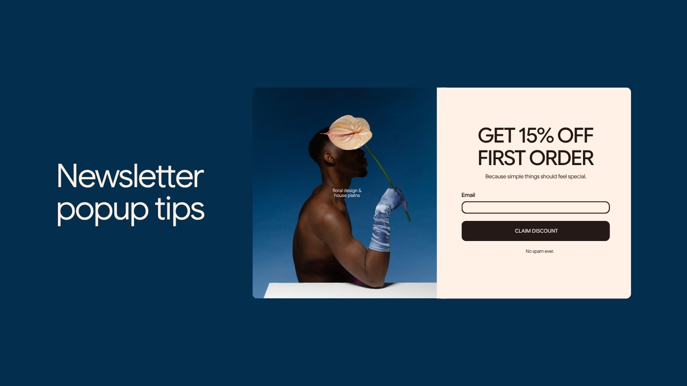
Learn how to create effective, non-intrusive newsletter pop-ups by offering clear value, matching offers to context, timing them well, and focusing on long-term subscriber engagement.