
Newsletter Pop-Up Tips and Examples to Grow Your Email List (Without Annoying Anyone)

Learn how to create effective, non-intrusive newsletter pop-ups by offering clear value, matching offers to context, timing them well, and focusing on long-term subscriber engagement.

Newsletter Pop-Up Tips and Examples to Grow Your Email List (Without Annoying Anyone)
Brandset TeamBrandset Team12 min de leitura

A newsletter pop-up works when the offer makes sense at the moment it appears.

The best newsletter pop-ups give visitors a clear reason to subscribe, explain what happens next, and appear without making the page harder to use. The form itself is the easy part.

Most bad pop-ups fail earlier.

They interrupt someone before they understand the website. They ask people to “join our newsletter” without explaining why. They cover the screen with a discount that has nothing to do with the page. Or they collect an email address and immediately follow it with messages the subscriber never expected.

A high signup rate cannot compensate for subscribers who regret signing up.

Build the relationship correctly from the pop-up forward.

Start With an Offer Worth an Email Address

“Subscribe to our newsletter” describes what the business wants.

It says nothing about what the visitor gets.

Compare:

Join our newsletter.

with:

Get one practical marketing idea every Tuesday.

The second version establishes an exchange. The visitor knows what will arrive and roughly how often.

The right offer depends on why someone is visiting.

An ecommerce shopper may care about first-order savings or early access.

A consultant's reader might want a useful checklist.

A local restaurant customer may want event announcements or priority reservations.

A SaaS visitor could want a practical guide related to the problem that brought them to the page.

Good newsletter pop-up offers often fall into a few categories:

  • a specific newsletter promise;

  • a useful guide, checklist, or template;

  • early access;

  • a legitimate first-purchase incentive;

  • updates about a topic the visitor has already shown interest in.

Specificity does most of the work.

Get our free guide is better than nothing.

Get the 12-step checklist for launching your first paid workshop gives the visitor something they can evaluate.

Make the Pop-Up Understandable Without Reading a Paragraph

Visitors should not have to decode a signup offer.

A useful pop-up can usually answer three questions quickly:

What am I getting?

Why might I want it?

What happens after I submit my email?

For example:

Make your next launch easier
Get the 12-step launch checklist plus one practical marketing email every Tuesday.

Email address

Get the checklist

The headline establishes the benefit.

The supporting copy explains the resource and ongoing email relationship.

The button describes what comes next.

No paragraph about the company is required.

Clarity matters even more when the pop-up interrupts something the visitor was already doing. Every extra sentence asks for another piece of attention.

Tell People What They Are Actually Subscribing To

A lead magnet should not become a quiet way to enroll someone in an unrelated marketing program.

If a visitor enters an email address to receive a checklist and will also receive your newsletter, say so.

Google's current guidance for subscription email tells senders to obtain clear consent and set expectations about the type and frequency of messages recipients will receive.

That can be handled in plain language:

Get the checklist and our weekly email about running a one-person marketing operation.

The visitor now understands the exchange.

This also improves the quality of the list.

A smaller group of people who knowingly asked for your emails is more useful than a larger database built through ambiguous forms.

Match the Offer to the Page

The same pop-up does not belong everywhere.

Imagine a home decor business.

Someone reading an article about choosing the right rug size has a different context from someone looking at a product collection.

On the article, a useful offer might be:

Stop guessing rug sizes
Get our room-by-room sizing guide plus practical decorating ideas by email.

On a shopping-focused page:

10% off your first order
Join the list for your welcome offer and occasional new-collection updates.

The underlying business is the same.

The reason to subscribe changes with the page.

This is why page targeting can matter more than endlessly rewriting the CTA.

Start with the visitor's current intent.

Then choose the offer.

Time the Newsletter Pop-Up Around the Visitor

The fastest way to make a reasonable offer feel intrusive is to show it too early.

A visitor clicks through from Google, the page loads, and a full-screen signup request immediately covers the content they came to read.

The business has asked for a relationship before providing evidence that the relationship is worth having.

There are several better approaches.

Show it on entry only when the context supports it

An entry pop-up can make sense on a campaign page specifically designed around an offer.

It makes less sense when someone has arrived to read an article and cannot see the article yet.

Use entry intentionally.

Use a delay when visitors need context first

Giving someone time to understand the page can make the signup request feel more natural.

There is no universal number of seconds that works for every site.

A short landing page and a long editorial page create different browsing behavior.

Test the experience rather than copying a “15-second rule.”

Use an on-leaving message for a final relevant offer

A visitor preparing to leave can be shown an offer connected to what they were viewing.

For example, someone leaving a page about brand strategy could see:

Want the framework before you go?
Get the positioning worksheet plus our weekly brand strategy email.

This works when the offer adds something useful.

Wait! Don't leave! does not.

Control how often the same person sees it

A good popup can become irritating when it appears during every visit.

Frequency controls matter because a visitor who closed an offer five minutes ago has already expressed a preference.

Give them space.

Do Not Let a Pop-Up Damage the Page It Sits On

Pop-ups also affect the experience around the form.

Google Search Central specifically warns against intrusive interstitials and dialogs that obstruct the page. Google says they can frustrate users, make content harder for search engines to understand, and potentially contribute to weaker search performance. It recommends less intrusive approaches such as banners that occupy only part of the screen.

This deserves particular attention on mobile.

A modal that looks restrained on a 27-inch monitor can cover nearly everything on a phone.

Check:

  • how much of the viewport the popup covers;

  • whether the close control is obvious;

  • whether the page remains understandable;

  • whether form fields are comfortable to use on a phone;

  • whether someone can dismiss it without fighting the interface.

Getting one more signup is a poor trade if the interaction makes the website worse for everyone else.

Keep the Form Short, but Collect What You Will Actually Use

For many newsletter pop-ups, an email address is enough.

First name can make sense when you plan to use it appropriately.

More fields need stronger justification.

Before adding company size, phone number, job title, industry, birthday, and three preference questions, ask what changes when you know the answer.

If nothing changes, the field is friction.

You can collect more context later through behavior, preferences, forms, purchases, and direct questions.

The signup form does not need to become a CRM intake questionnaire.

Write CTA Buttons Around the Outcome

Buttons such as Submit and Click here describe interface actions.

The visitor already knows they are clicking a button.

Use the space to reinforce what they receive.

Compare:

Weak

Clearer

Submit

Get the guide

Sign up

Join the weekly email

Click here

Send me the checklist

Subscribe

Get Tuesday's email

Submit form

Get 10% off

Do not force this into awkward first-person copy.

Send me my discount can work.

I want to obtain my exclusive savings opportunity cannot.

Read the button out loud.

If it sounds unnatural, simplify it.

Use Images When They Help Explain the Offer

A newsletter pop-up does not automatically need an image.

For a product business, a strong product photograph may make the offer easier to understand.

A creator may use a real portrait when the newsletter is closely tied to the person's identity.

A lead magnet can show the actual guide or template.

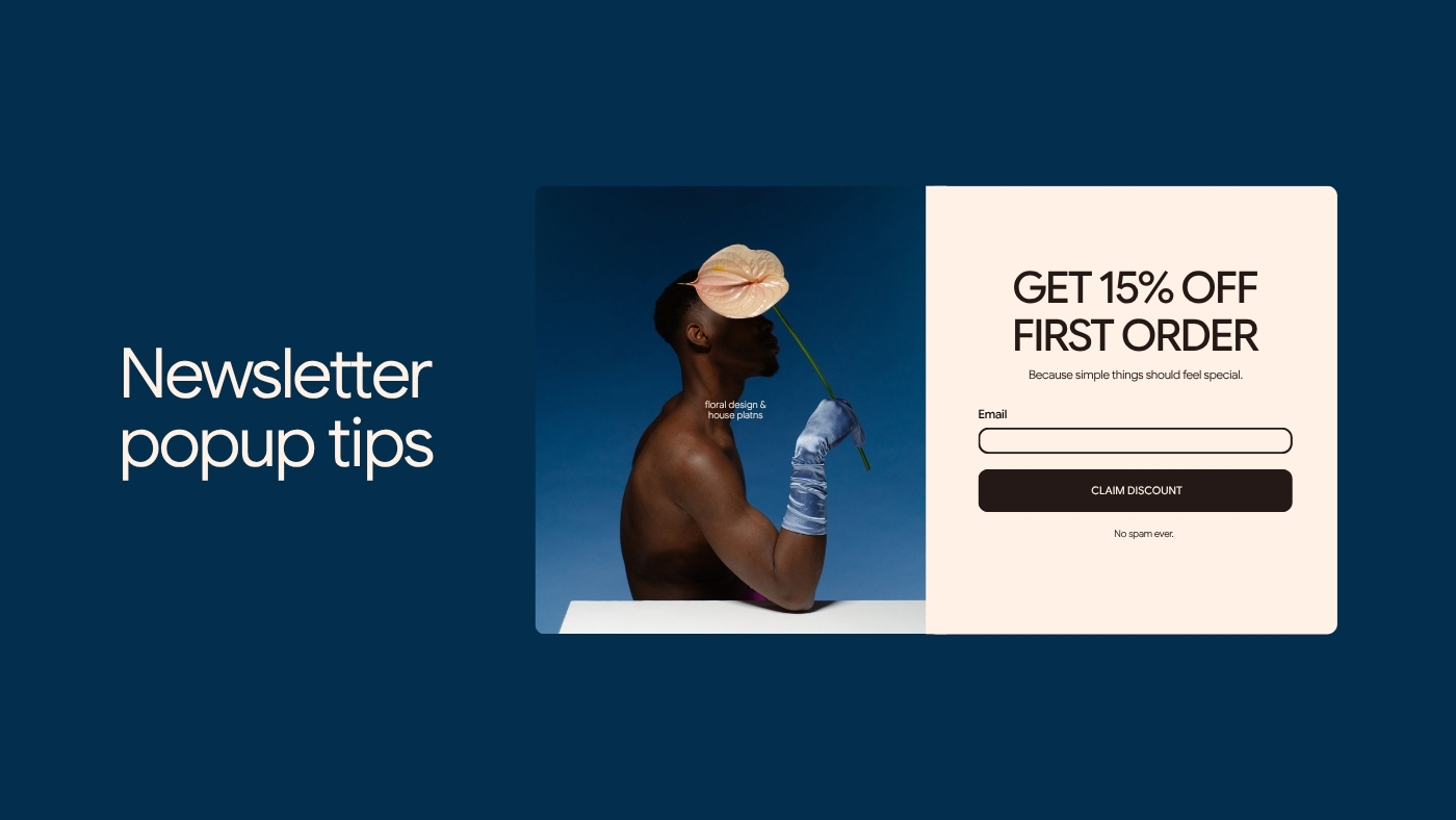
A visual should help answer what is this? or is this for me?

Generic stock photography often occupies valuable space without answering either question.

A B2B newsletter about cash-flow management does not become more persuasive because the popup contains a stock photo of three people pointing at a laptop.

When copy carries the offer well, the cleanest visual decision may be no image at all.

5 Newsletter Pop-Up Examples You Can Adapt

These are starting points. The offer should match the audience, page, and actual emails your business plans to send.

1. The Useful Weekly Newsletter

Best for: consultants, freelancers, SaaS businesses, professional services

One useful marketing idea every Tuesday
Practical ways to improve your website, email, and content without adding more tools.

Get Tuesday's email

Why it works: The promise is specific about subject matter and cadence. The subscriber does not have to guess what “our newsletter” means.

2. The Ecommerce Welcome Offer

Best for: ecommerce and product businesses

10% off your first order
Get your welcome code plus early access to new collections and occasional product updates.

Get 10% off

Why it works: The immediate incentive is clear, and the copy explains that future marketing emails come with it.

Use discounts only when the economics make sense. A popup does not become effective simply because the percentage is larger.

3. The Content-Specific Lead Magnet

Best for: blogs, consultants, educators, service businesses

Planning a website redesign?
Get the 15-point checklist to review before you hire a designer or touch the homepage.

Get the checklist

Why it works: The offer matches a specific problem and naturally belongs beside content about website projects.

If the subscriber will also enter an ongoing newsletter, state that near the form.

4. The Early-Access Signup

Best for: launches, events, limited releases, creators

Be first to see the next collection
Join the list for launch dates, previews, and early-access links.

Get early access

Why it works: Joining has a clear purpose. The email itself is part of the product-launch experience rather than an unrelated marketing request.

5. The On-Leaving Resource

Best for: educational pages and visitors who have not converted

Before you go: take the template
Get the simple campaign-planning template from this guide, plus one practical email each week.

Send me the template

Why it works: The offer extends what the visitor was already consuming instead of interrupting them with something unrelated.

Measure More Than the Pop-Up Conversion Rate

Suppose Popup A converts 7% of visitors and Popup B converts 4%.

Popup A looks like the winner.

Now suppose the first group unsubscribes quickly and rarely clicks anything, while subscribers from Popup B continue reading, clicking, and eventually buying.

The signup rate only measured the first transaction.

Track what happens after it.

Depending on the business, that can include:

  • confirmed subscriptions;

  • engagement with the welcome email;

  • clicks;

  • purchases;

  • qualified leads;

  • unsubscribe rate;

  • spam complaints;

  • revenue or conversions from subscribers acquired through the popup.

This is especially important when comparing incentives.

A large discount can increase signup volume while attracting people primarily interested in the discount.

That is not necessarily bad.

It is something you need to know.

Test One Meaningful Change at a Time

Popup optimization gets messy when five things change at once.

The offer changes.

The image changes.

The CTA changes.

The timing changes.

The page targeting changes.

Conversion improves.

Nobody knows why.

Start with the variable most likely to matter.

If visitors do not understand the offer, test the offer or headline.

If they dismiss it immediately, timing may deserve attention.

If a generic site-wide popup performs inconsistently, test a page-specific offer.

If signups are healthy but subscribers disappear afterward, stop optimizing the popup and investigate what happens after signup.

The best test is the one tied to a real problem.

Treat the Signup as the Beginning, Not the Conversion

A visitor enters an email address.

The popup worked.

Now the more important test begins.

Did the promised resource arrive?

Does the first email match what the popup said?

Does the sender look recognizable?

Is the subscriber immediately hit with five promotional emails they never expected?

Can they unsubscribe easily?

The signup creates an expectation that the next interaction either confirms or breaks.

This is where many “high-converting” pop-ups become bad email programs.

The popup should promise only what the system behind it can deliver.

Keep the Popup and the Follow-Up Connected

For a small team, newsletter signup gets harder to manage when the page, form, CRM, email tool, audience rules, and brand settings live in different places.

The visitor does not care how many tools are behind the experience.

They care that what happens after clicking the button matches what the popup promised.

In Brandset, you can choose specific Landing Pages and Link in Bio pages where a popup should appear. Each destination can be configured separately with Frequency, On entering the page, Delay, and On leaving the page, so the same popup does not have to behave identically everywhere.

That matters because timing and context belong together. An offer that makes sense immediately on one page may deserve a delay on another.

Before publishing your next popup, read it once as the visitor and answer three questions:

Why would I give this business my email?

Do I know what they will send afterward?

Is this a reasonable moment to ask?

If any answer is unclear, fix that before changing the button color.

Start your 7-day free trial →